Minimising buyer returns by 20% with seller-driven product template feedback
Minimising buyer returns by 20% with seller-driven product template feedback
Problem
Sellers reported that some product templates had incorrect information, leading to buyer complaints and returns. There was no clear way to flag these issues, creating frustration and harming trust.
Sellers reported that some product templates had incorrect information, leading to buyer complaints and returns. There was no clear way to flag these issues, creating frustration and harming trust.
Solution
We built a tool that let sellers report mistakes and suggest corrections, including a source for validation. Around 1,000 reports were submitted monthly, 40% led to fixes, and returns dropped by 20%.
Solution
We built a tool that let sellers report mistakes and suggest corrections, including a source for validation. Around 1,000 reports were submitted monthly, 40% led to fixes, and returns dropped by 20%.
Solution
We built a tool that let sellers report mistakes and suggest corrections, including a source for validation. Around 1,000 reports were submitted monthly, 40% led to fixes, and returns dropped by 20%.
My role
Product Designer
My role
Product Designer
My role
Product Designer
Company
Mercado Libre
Company
Mercado Libre
Company
Mercado Libre
Date
2020
Date
2020
Date
2020
Problem
What were we trying to solve?
What were we trying to solve?
The platform is an e-commerce marketplace. For common products like phones, the platform creates shared product templates with photos and descriptions. Sellers simply select the correct product and set their own price.
Some sellers began reporting that these templates contained mistakes—wrong specs, missing details, or inaccurate photos.
This led to unhappy buyers, complaints, and product returns, which affected both seller performance and customer trust.
This led to unhappy buyers, complaints, and product returns, which affected both seller performance and customer trust.
There was no formal way for sellers to report these issues, and no defined process for the internal team to act on them.
There was no formal way for sellers to report these issues, and no defined process for the internal team to act on them.
‘The templates have mistakes, and that makes buyers return my products’
‘The templates have mistakes, and that makes buyers return my products’
🎯 The goal was to let sellers flag errors so the template team could fix them, improving accuracy and reducing returns.
🎯 The goal was to let sellers flag errors so the template team could fix them, improving accuracy and reducing returns.
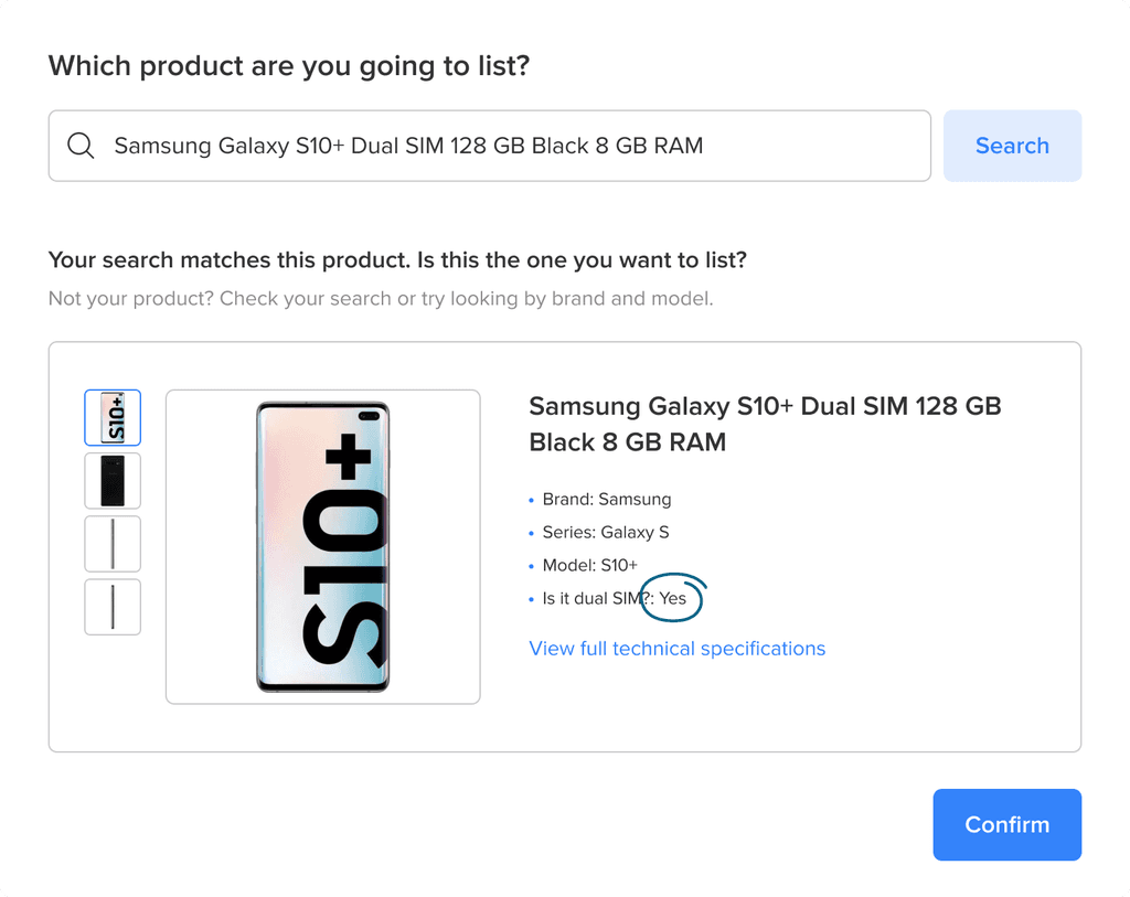
'The product I want to sell is this one, but this model doesn’t have dual SIM.'
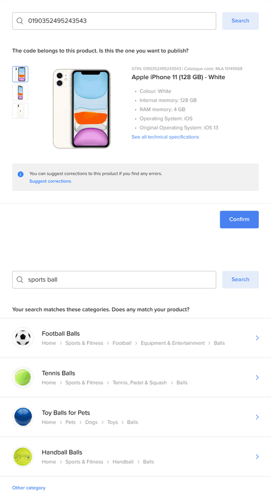
Solution
A tool for sellers to report template mistakes
A tool for sellers to report template mistakes
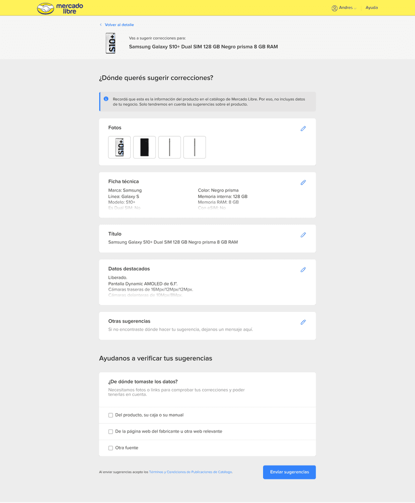
We designed a tool that allowed sellers to select a product template and suggest corrections. Their edits were sent directly to the team responsible for maintaining product information.
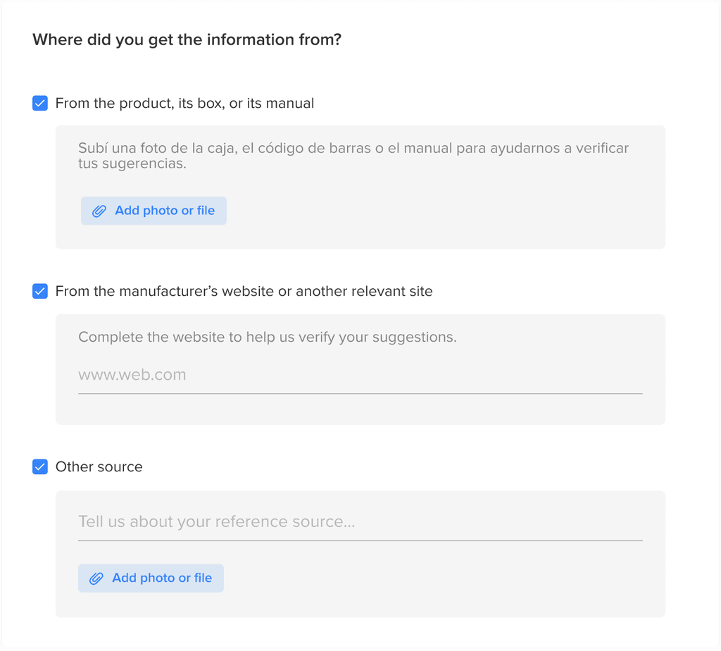
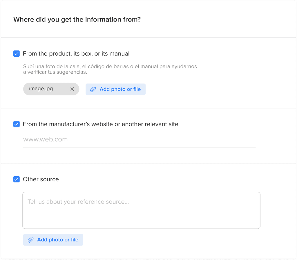
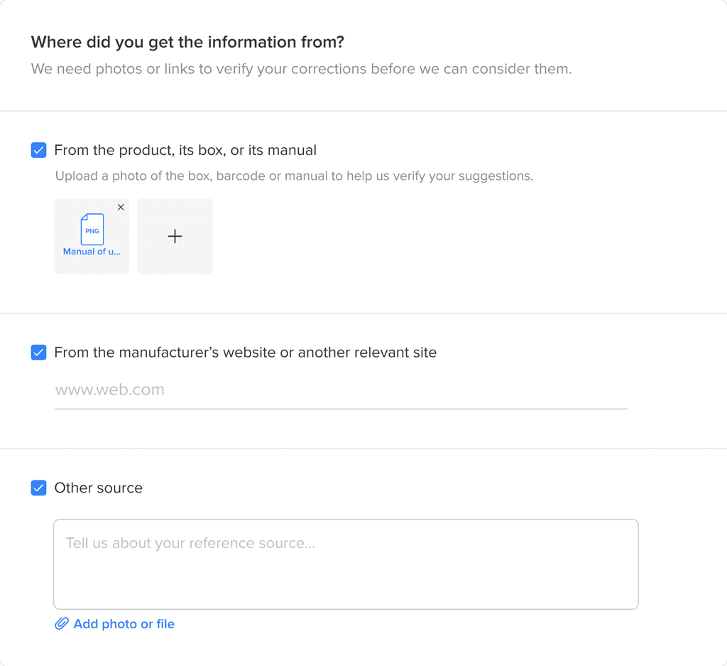
To help with validation, we added a field where sellers could indicate the source of their correction—such as the product itself, its packaging, manual, or official website.
We designed a tool that allowed sellers to select a product template and suggest corrections. Their edits were sent directly to the team responsible for maintaining product information.
To help with validation, we added a field where sellers could indicate the source of their correction—such as the product itself, its packaging, manual, or official website.
40%
Seller reports
turned into updates
-20%
Product returns
The process
How did we do it?
How did we do it?
01
02
03
04
05
Step 1
Step 1
Step 1
Understand the problem
Understand the problem
Understand the problem
Step 2
Frame the scope
Frame the scope
Step 2
Frame the scope
Step 3
Step 3
Define layout
Define layout
Step 3
Define layout
Step 4
Step 4
Design interface elements
Design interface elements
Step 4
Design interface elements
Step 5
Step 5
Implement
Implement
Step 5
Implement
Step 1
Step 1
Understand the problem
Understand the problem
We noticed that some sellers weren’t using our product templates as intended. Since these templates are designed to provide accurate and consistent information that improves the buyer experience, our goal was to understand why sellers avoided them and find ways to increase their adoption.
We noticed that some sellers weren’t using our product templates as intended. Since these templates are designed to provide accurate and consistent information that improves the buyer experience, our goal was to understand why sellers avoided them and find ways to increase their adoption.
Quantitative research
Quantitative research
To understand why sellers were not fully using the product templates, we conducted surveys with our users. Our goal was to discover their awareness, usage patterns, and reasons for avoiding the templates.
To understand why sellers were not fully using the product templates, we conducted surveys with our users. Our goal was to discover their awareness, usage patterns, and reasons for avoiding the templates.
How many of your products use the templates?
How many of your products use the templates?
50% sometimes use it
25% used it and then deleted all the listings with template
14% never used it
11% use it every time
Why don't you use it?
38% said that this model forced them to lower their prices
27% said that there were mistakes in the content of the templates
8% said that they had little profit margin
6% said it generated problems with their stock management
21% stated another reasons
Why don't you use it?
38% said that this model forced them to lower their prices
27% said that there were mistakes in the content of the templates
8% said that they had little profit margin
6% said it generated problems with their stock management
21% stated another reasons
Why don't you use it?
38% said that this model forced them to lower their prices
27% said that there were mistakes in the content of the templates
8% said that they had little profit margin
6% said it generated problems with their stock management
21% stated another reasons
Unexpected insight: Template errors
While price competition was an expected trade-off of the shared template model, we uncovered a more surprising issue—many sellers were encountering errors in the template content.
Since this was not something the team had anticipated, we decided to dig deeper.
!
Unexpected insight: Template errors
While price competition was an expected trade-off of the shared template model, we uncovered a more surprising issue—many sellers were encountering errors in the template content.
Since this was not something the team had anticipated, we decided to dig deeper.
!
Unexpected insight: Template errors
While price competition was an expected trade-off of the shared template model, we uncovered a more surprising issue—many sellers were encountering errors in the template content.
Since this was not something the team had anticipated, we decided to dig deeper.
!
Qualitative research
Qualitative research
We visited sellers to observe their workflows and better understand their frustrations with the product templates. Several confirmed that incorrect product information was causing real issues: buyers received products that didn’t match the listing and ended up returning them.
We visited sellers to observe their workflows and better understand their frustrations with the product templates. Several confirmed that incorrect product information was causing real issues: buyers received products that didn’t match the listing and ended up returning them.
'The negative point I see: Why do you ask me for so many details if you put them wrong? There is a lot of wrong information. For example, there is a phone that is a duo and in the picture you put only one of them. Another one says it has an answering machine, but it doesn’t.'

Defining the problem
Defining the problem
From this research, we clearly identified that errors in product templates were causing buyer dissatisfaction, increased returns, and seller frustration. Our project goal became clear: Fix the inaccurate product details in the templates to improve seller trust and reduce returns.
From this research, we clearly identified that errors in product templates were causing buyer dissatisfaction, increased returns, and seller frustration. Our project goal became clear: Fix the inaccurate product details in the templates to improve seller trust and reduce returns.
Step 2
Step 2
Frame the scope
Frame the scope
I organised a series of sessions with the editorialisation team—the team responsible for creating and maintaining product templates—as well as the engineering team.
Since the editorialisation team were the ones responsible for correcting inaccurate templates, it was important to involve them early and understand their workflow, limitations, and what kind of information they needed in order to make updates.
We decided to build a tool to capture seller feedback
We decided to build a tool to capture seller feedback
This would give us a scalable way to identify and correct inaccurate template details, using input from the people who know these products best—our sellers.
The editorialisation team would receive these suggestions, validate them using the provided references, and make the necessary updates.
This would give us a scalable way to identify and correct inaccurate template details, using input from the people who know these products best—our sellers.
The editorialisation team would receive these suggestions, validate them using the provided references, and make the necessary updates.
This would give us a scalable way to identify and correct inaccurate template details, using input from the people who know these products best—our sellers.
The editorialisation team would receive these suggestions, validate them using the provided references, and make the necessary updates.
Seller
Seller
Seller
Selects a listing
Selects a listing
Selects a listing
Selects a listing
The seller chooses one of their existing listings based on a product template.
The seller chooses one of their existing listings based on a product template.
The seller chooses one of their existing listings based on a product template.
Seller
Seller
Seller
Suggests a correction
Suggests a correction
Suggests a correction
Suggests a correction
They review the product information and submit a correction for any inaccurate detail (title, specs, images, etc.).
Seller
Seller
Seller
Provides a reference
Provides a reference
Provides a reference
Provides a reference
To support the suggestion, the seller includes a reference—such as the product packaging, manual, or official website.
Editorialisation team
Editorialisation team
Editorialisation team
Reviews the suggestion
Reviews the suggestion
Reviews the suggestion
Reviews the suggestion
The internal team checks the feedback and verifies it against the source provided.
Editorialisation team
Editorialisation team
Editorialisation team
Correction goes live
If approved, the corrected detail is updated on the product template for all listings using it.
Step 3
Step 3
Define layout
Define layout
Benchmarking first
Benchmarking first
I started by analysing how other platforms handle user feedback on product information. This helped me spot good and bad practices, giving us a solid starting point to design a clear and intuitive experience for sellers.
I started by analysing how other platforms handle user feedback on product information. This helped me spot good and bad practices, giving us a solid starting point to design a clear and intuitive experience for sellers.
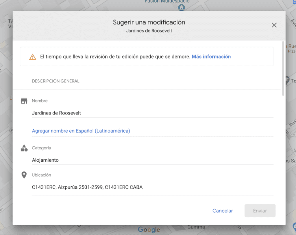
Google Maps
Google Maps
Suggestions in google maps are made in a modal. The user can see all the information in edit mode and change anything as they needed to.
Google asks for a reference source but it is optional to complete it.
Suggestions in google maps are made in a modal. The user can see all the information in edit mode and change anything as they needed to.
Google asks for a reference source but it is optional to complete it.
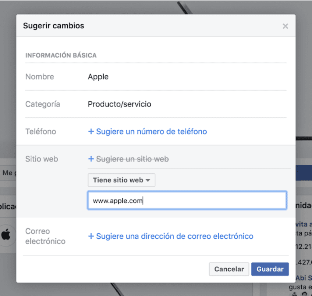
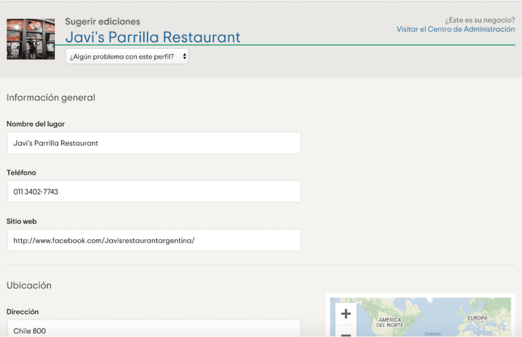
On Facebook fanpages, users can suggest edits. The information is visible on a modal in a read-only mode and can be edited after clicking on the information.
On Facebook fanpages, users can suggest edits. The information is visible on a modal in a read-only mode and can be edited after clicking on the information.
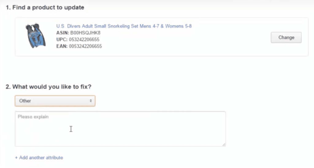
Amazon
Sellers at Amazon can suggest edits on the products.
In their case, the information is not entirely visible, so you have to choose which information to edit on different steps.
Amazon
Sellers at Amazon can suggest edits on the products.
In their case, the information is not entirely visible, so you have to choose which information to edit on different steps.
TripAdvisor
When you suggest edits on the information of a place, TripAdvisor shows you all the information on edit mode.
The amount of information is huge, so it makes the scrolling really long.
TripAdvisor
When you suggest edits on the information of a place, TripAdvisor shows you all the information on edit mode.
The amount of information is huge, so it makes the scrolling really long.
I then created some layout options
I then created some layout options
Since sellers come to this flow with a specific correction in mind, it was key to make the screen easy to scan—helping them quickly find and edit the detail they spotted as wrong. I explored different layout options and compared them to identify the most scannable and efficient structure.
Since sellers come to this flow with a specific correction in mind, it was key to make the screen easy to scan—helping them quickly find and edit the detail they spotted as wrong. I explored different layout options and compared them to identify the most scannable and efficient structure.
Option 1
Option 1
All the product information is visible on edit mode.
All the product information is visible on edit mode.
Option 2
Option 2
We show a list of all the information that can be edited and when the user clicks on any of them, the component expands to show the edit mode.
We show a list of all the information that can be edited and when the user clicks on any of them, the component expands to show the edit mode.
Option 3
Option 3
First the user chooses which information they want to edit and then it is shown. If they want to edit new information, it is added below.
First the user chooses which information they want to edit and then it is shown. If they want to edit new information, it is added below.
Option 4
Option 4
The task is divided in two steps. First, the user chooses all the information they want to edit. After that, they edit it.
The task is divided in two steps. First, the user chooses all the information they want to edit. After that, they edit it.
Comparison
Comparison
Option 1
Option 2
Option 3
Option 4
Easy scanning through the information
✅ Has to scroll a lot to see all the options
✅ To see all the options, they need a minimum scroll
✅ They can see all options on the screen
✅ They can see all options on the screen
Cognitive load required
👍 Little cognitive load needed
❌ A lot of cognitive load needed
❌ A lot of cognitive load needed
❌ A lot of cognitive load needed
Easy recovery from error
👍 No risk of making mistakes because the information is visible
👍 Can recover only by clicking on another accordion
❌ Can recover by clicking on the top component. It is easy to click but not that easy to find
❌ It is not easy as they have to take a step backwards
Merging the best of both layouts
Merging the best of both layouts
After sharing with the rest of the team, we chose to combine their strengths into a single solution.
We kept the accordion from Option 1 to reduce cognitive load and scrolling, while incorporating the clear, scannable structure of Option 2. To improve clarity, we added a preview of the content inside each accordion and replaced the chevron with a pencil icon to clearly signal the action of editing.
Step 4
Step 4
Design interface elements
Design interface elements
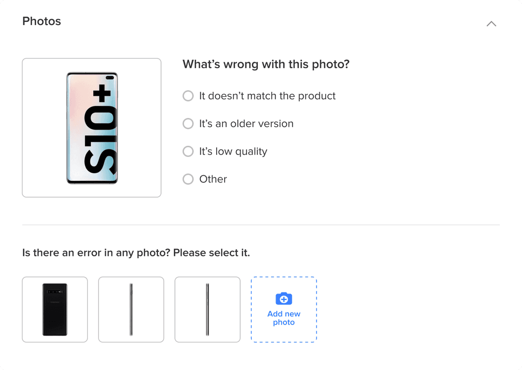
Photos component
Photos component
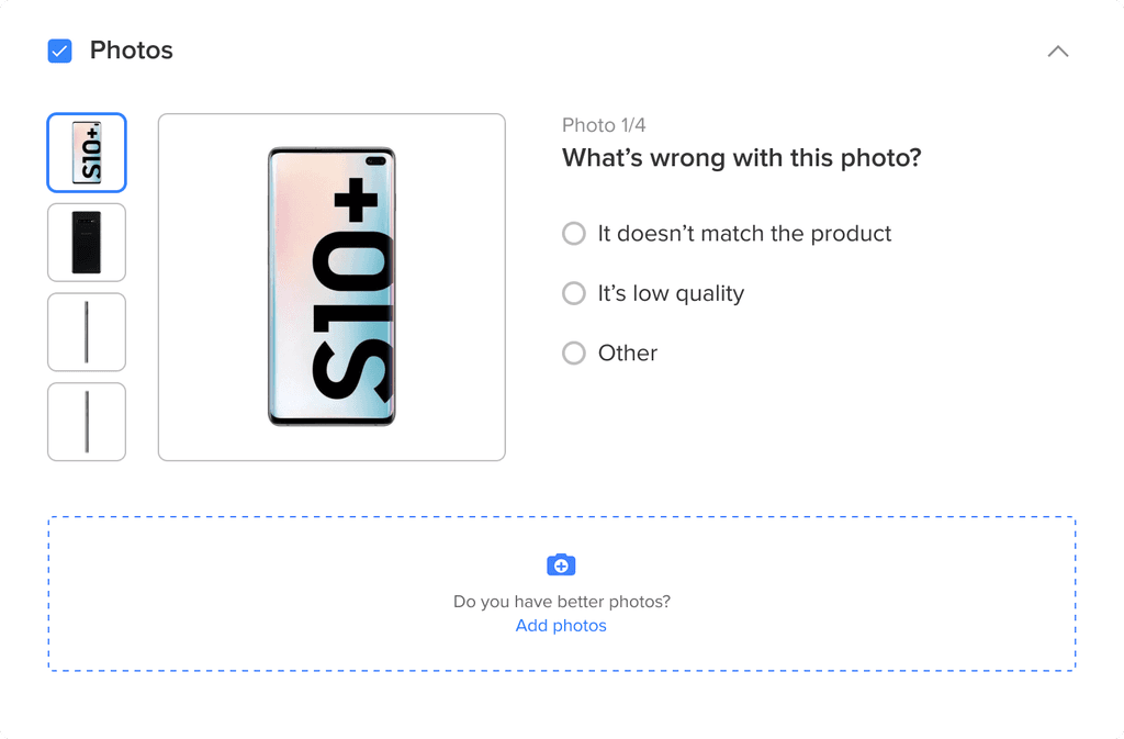
Initial idea
The user selects the photo and explains the error on the right hand side. Then, clicks on another photo and explains the other error.
Users can add new photos, but they are not linked to any of the original photos.
⚠️ Problem: In this option it was not possible to see all the errors at the same time, because it only showed one photo at a time.
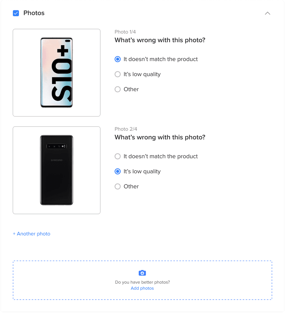
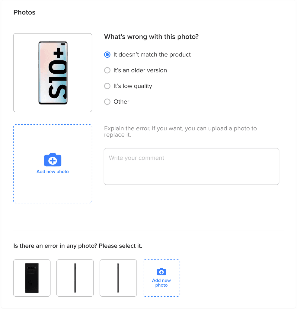
Iteration 1
So they can see all the reported errors at a time, in this option each photo was added at the bottom of the other.
⚠️ Problem: To select the next photo, two clicks were needed (one to add a photo, and another one to select which one). We thought that problem could be optimised.
Iteration 1
So they can see all the reported errors at a time, in this option each photo was added at the bottom of the other.
⚠️ Problem: To select the next photo, two clicks were needed (one to add a photo, and another one to select which one). We thought that problem could be optimised.
Iteration 2
We show all the photos of the product so that they can be selected only with one click.
⚠️ Problem: Now we realised that the users should be able to add an explanation of the error.
Iteration 2
We show all the photos of the product so that they can be selected only with one click.
⚠️ Problem: Now we realised that the users should be able to add an explanation of the error.
Iteration 3
After choosing one of the options of the radio button, a textarea appears that allows the user to explain more about the error.
⚠️ Problem: All this information took a lot of space.
Iteration 3
After choosing one of the options of the radio button, a textarea appears that allows the user to explain more about the error.
⚠️ Problem: All this information took a lot of space.
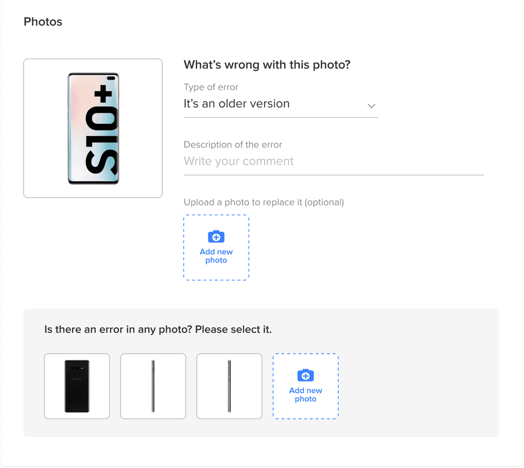
Iteration 4
To save space, I replaced the radio buttons with a dropdown, and the textarea with an inline input.
⚠️ Problem: It's still using a lot of space
Iteration 4
To save space, I replaced the radio buttons with a dropdown, and the textarea with an inline input.
⚠️ Problem: It's still using a lot of space
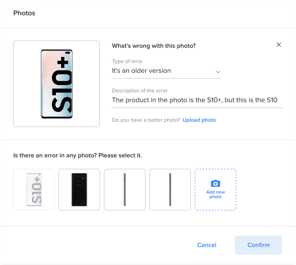
Iteration 5 (Final)
I replaced the button for adding a new photo with a textlink.
Iteration 5 (Final)
I replaced the button for adding a new photo with a textlink.
Reference source
Reference source
Initial idea
When users clicked on the source, it displayed a grey box to complete more information.
⚠️ Problem: The grey background took a lot of attention and it had low contrast.
Initial idea
When users clicked on the source, it displayed a grey box to complete more information.
⚠️ Problem: The grey background took a lot of attention and it had low contrast.
Iteration 1
I used dividers and gave more white space between the elements to have a clearer component.
⚠️ Problem: The buttons were too heavy.
Iteration 1
I used dividers and gave more white space between the elements to have a clearer component.
⚠️ Problem: The buttons were too heavy.
Iteration 2 (Final)
For the attachment, I reused a pattern that we were using on another part of the website for consistency.
I changed the buttons to a smaller hierarchy so the screen was cleaner.
Iteration 2 (Final)
For the attachment, I reused a pattern that we were using on another part of the website for consistency.
I changed the buttons to a smaller hierarchy so the screen was cleaner.
Rest of the component
Rest of the component
The rest of the components were more simple so it didn't take as many iterations.
The rest of the components were more simple so it didn't take as many iterations.
Technical specifications
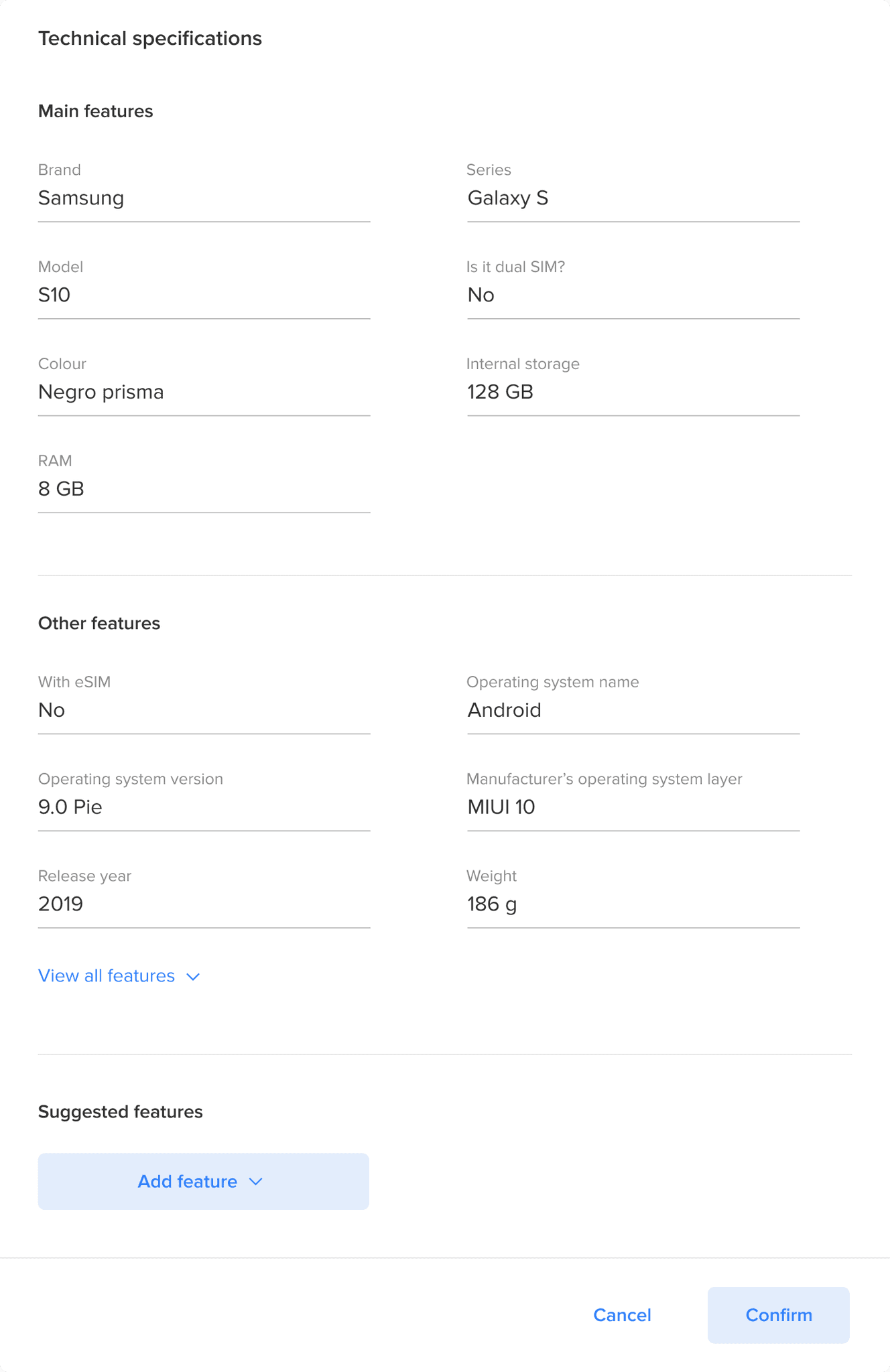
In this component, all the features of the product were display. I added an accordion because they can be a lot,.
There could be some features that we don't have, so they could also add more.
Technical specifications
In this component, all the features of the product were display. I added an accordion because they can be a lot,.
There could be some features that we don't have, so they could also add more.
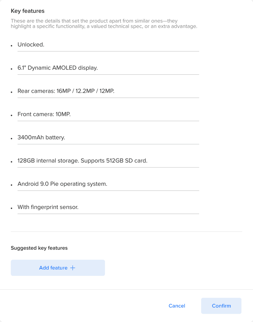
Key features
These were some characteristics of the products that were displayed to the buyer as bullet points.
The sellers could edit them or add new ones.
Key features
These were some characteristics of the products that were displayed to the buyer as bullet points.
The sellers could edit them or add new ones.
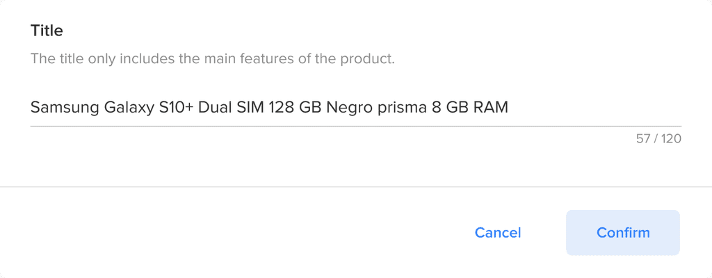
Title
Just the title of the listing, it only displayed the name of the product.
Title
Just the title of the listing, it only displayed the name of the product.
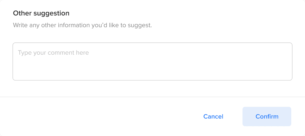
Other suggestion
In case there was something else that we were missing, we added a free text field.
Other suggestion
In case there was something else that we were missing, we added a free text field.
Step 5
Step 5
Implement
Implement
We implemented the tool for sellers to suggest corrections directly from the product listings. Once submitted, the editorialisation team reviewed and validated the suggestions before applying them.
We implemented the tool for sellers to suggest corrections directly from the product listings. Once submitted, the editorialisation team reviewed and validated the suggestions before applying them.
40%
Seller reports
turned into updates
-20%
Product returns

Learnings
Learnings
🤓
Real understanding comes from real use
🤓
Real understanding comes from real use
Talking to sellers directly and observing their workflows helped us uncover an issue that wasn’t visible in the data: incorrect product details in templates. Without those early visits, we might have misdiagnosed the low adoption.
🤝
Involve key stakeholders early
🤝
Involve key stakeholders early
Collaborating closely with the editorialisation team from the beginning ensured the tool would be actionable for them. Understanding their review process was key to designing an efficient flow.
🔄
Iteration leads to clarity
🔄
Iteration leads to clarity
By prototyping and refining the components across multiple rounds, we found the right balance between clarity and space. This was crucial in areas with dense information, like photos and technical specs.
Back to top