Increasing product identification from 30% to 90% with a search-based listing flow

Increasing product identification from 30% to 90% with a search-based listing flow

Problem

Sellers had to manually enter product details, often leading to errors and mismatches with our catalog. This caused unnecessary work and reduced listing accuracy—only 30% matched correctly.

Sellers had to manually enter product details, often leading to errors and mismatches with our catalog. This caused unnecessary work and reduced listing accuracy—only 30% matched correctly.

Solution

We added a search step so sellers could find their product in the catalog first. This reduced manual input and errors, raising match accuracy from 30% to 90%.

Solution

We added a search step so sellers could find their product in the catalog first. This reduced manual input and errors, raising match accuracy from 30% to 90%.

Solution

We added a search step so sellers could find their product in the catalog first. This reduced manual input and errors, raising match accuracy from 30% to 90%.

My role

Product Designer

My role

Product Designer

My role

Product Designer

Company

Mercado Libre

Company

Mercado Libre

Company

Mercado Libre

Date

2020

Date

2020

Date

2020

Problem

What were we trying to solve?

What were we trying to solve?

The platform is an e-commerce marketplace. When sellers created listings, they had to manually enter all the product information, and we tried to match it with a product in our catalog afterward.

This led to issues:

The platform is an e-commerce marketplace. When sellers created listings, they had to manually enter all the product information, and we tried to match it with a product in our catalog afterward.

This led to issues:

Sellers often entered incorrect or inconsistent details (e.g. confusing RAM with storage, or writing ‘Black’ instead of the official colour name ‘Space grey’).

Sellers often entered incorrect or inconsistent details (e.g. confusing RAM with storage, or writing ‘Black’ instead of the official colour name ‘Space grey’).

Many listings didn’t match any catalog product, or matched the wrong one.

Many listings didn’t match any catalog product, or matched the wrong one.

Sellers were doing unnecessary work by filling in data we already had.

Sellers were doing unnecessary work by filling in data we already had.

30% of the times we couldn’t match the product

30% of the times we couldn’t match the product

🎯 The goal was to increase the number of listings correctly matched to our product catalog to reduce errors and improve buyer trust.

🎯 The goal was to increase the number of listings correctly matched to our product catalog to reduce errors and improve buyer trust.

Sellers completed the details of the product they want to sell...

Sellers completed the details of the product they want to sell...

...and then we tried to guess which product from our catalog it was

...and then we tried to guess which product from our catalog it was

Solution

A search-based flow to match listings with our catalog

A search-based flow to match listings with our catalog

We replaced the manual input with a search box. Based on the seller's search, the system suggested matching products from our catalog — helping sellers quickly find the correct one.

The flow was flexible to handle different scenarios—whether there was one match, multiple, or none. In cases without a match, sellers could still complete the listing manually.

Listings matched to a product increased from 30% to 90%

Listings matched to a product increased from 30% to 90%

The process

How did we do it?

How did we do it?

01

02

03

04

05

Step 1

Step 1

Step 1

Understand the problem

Understand the problem

Understand the problem

Step 2

Mapping scenarios

Mapping scenarios

Step 2

Mapping scenarios

Step 3

Step 3

Develop the visual design

Develop the visual design

Step 3

Develop the visual design

Step 4

Step 4

Validate and iterate

Validate and iterate

Step 4

Validate and iterate

Step 5

Step 5

Implement

Implement

Step 5

Implement

Step 1

Step 1

Understand the problem

Understand the problem

The platform was.an e-commerce marketplace with a product catalog designed to standardise listings, helping buyers compare products and trust the information.

The platform was.an e-commerce marketplace with a product catalog designed to standardise listings, helping buyers compare products and trust the information.

We only recognised 30% of the listed products, and we needed to increase that number

We only recognised 30% of the listed products, and we needed to increase that number

At the start of the project, only 3 out of 10 cellphones listed were correctly matched to a catalog product. The rest were either mismatched or unmatched—leading to errors, reduced buyer trust, and extra work for sellers.

At the start of the project, only 3 out of 10 cellphones listed were correctly matched to a catalog product. The rest were either mismatched or unmatched—leading to errors, reduced buyer trust, and extra work for sellers.

iPhone X

iPhone X

iPhone X

iPhone X

Samsung S10

Samsung S10

Samsung S10

Samsung S10

Xiaomi Redmi Note 8

Xiaomi Redmi Note 8

Xiaomi Redmi Note 8

Xiaomi Redmi Note 8

Product not recognised

Product not recognised

Product not recognised

Product not recognised

Product not recognised

Product not recognised

Product not recognised

Product not recognised

Product not recognised

Product not recognised

Product not recognised

Product not recognised

Product not recognised

Product not recognised

Product not recognised

Product not recognised

Product not recognised

Product not recognised

Product not recognised

Product not recognised

Product not recognised

Product not recognised

Product not recognised

Product not recognised

Product not recognised

Product not recognised

Product not recognised

Product not recognised

Our funnel wasn’t optimised to collect the right information to recognise products

Our funnel wasn’t optimised to collect the right information to recognise products

We reviewed key pain points in the listing flow, gathered from previous research studies, and found that the way we were collecting information often led to incomplete or inconsistent data. This made it difficult for the system to reliably match listings to the correct catalog product.

We reviewed key pain points in the listing flow, gathered from previous research studies, and found that the way we were collecting information often led to incomplete or inconsistent data. This made it difficult for the system to reliably match listings to the correct catalog product.

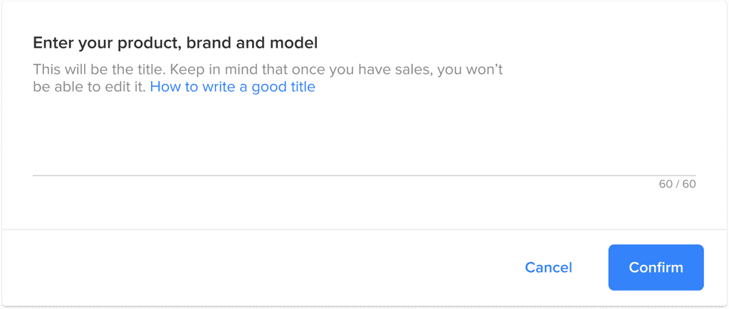
Problem #1: Sellers used the title for marketing, not for product identification

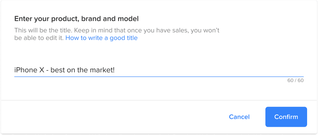
The first step of the funnel asked sellers to write a title for their listing. We then used that title to predict which product they were trying to sell.

However, sellers often wrote titles aimed at attracting buyers rather than accurately describing the product. As a result, the information was too vague or misleading for us to reliably match it to a product in the catalog.

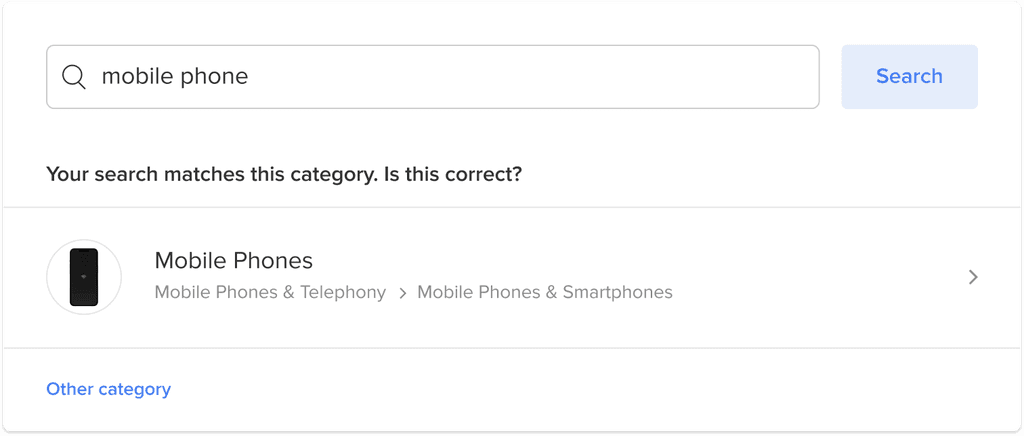
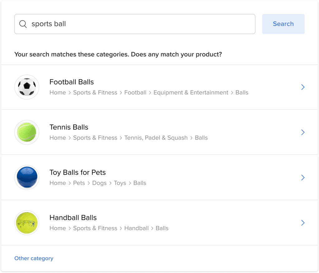
Problem #2: Manual category selection created unnecessary friction and errors

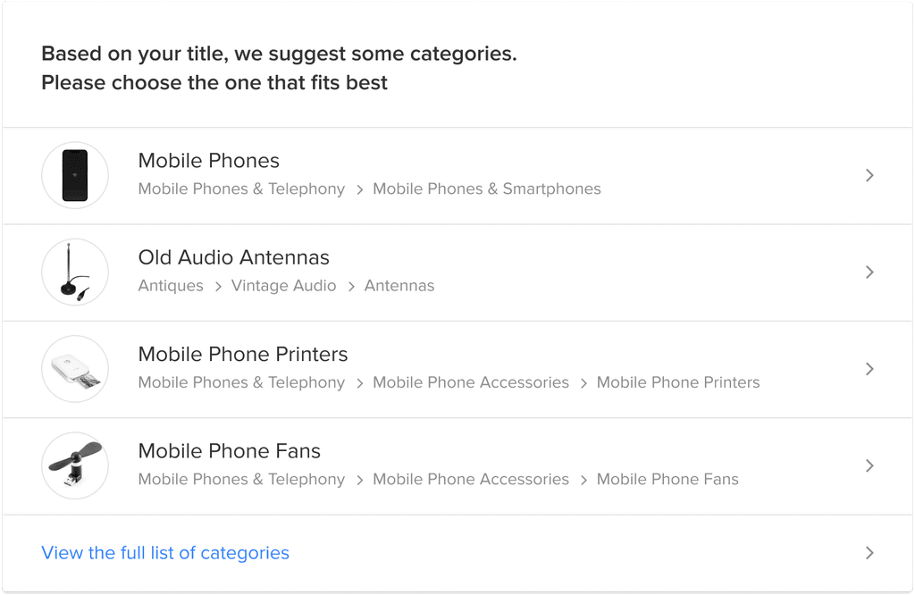
After the seller entered the title, we used it to predict possible product categories. But instead of auto-selecting the most likely match, we always asked the seller to manually choose a category.

This added an extra step to the flow—even when our prediction was correct—and introduced room for error. If the seller chose the wrong category, we couldn’t match the listing to the correct product in the catalog.

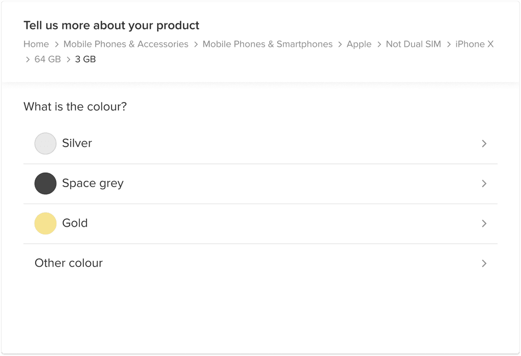
Problem #3: Sellers frequently entered incorrect attribute data

After choosing a category, sellers had to manually complete product attributes. This led to frequent mistakes — for example:

  • Confusing RAM with storage capacity

  • Entering generic colours like "Black" instead of the official name, like "Space Grey"

These errors often prevented us from correctly matching the product with our catalog.

To solve the problem, the engineers proposed a search box to improve product matching

To solve the problem, the engineers proposed a search box to improve product matching

This search box was placed at the very beginning of the listing flow, allowing sellers to quickly find their product within the catalog.

This search box was placed at the very beginning of the listing flow, allowing sellers to quickly find their product within the catalog.

Before: Manual, error-prone flow

Before: Manual, error-prone flow

Enter listing title

Manually select category

Manually fill in product attributes

System tries to match listing to catalog

After: Search-first, catalog-driven flow

After: Search-first, catalog-driven flow

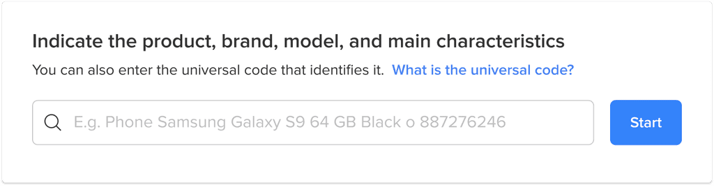
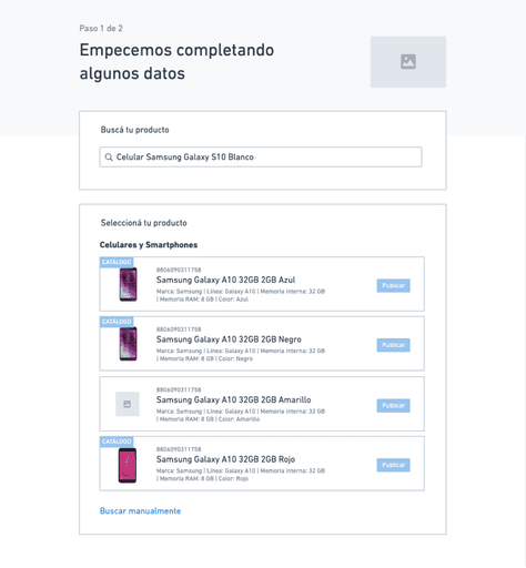
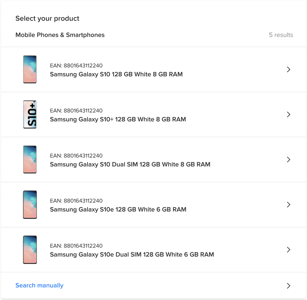
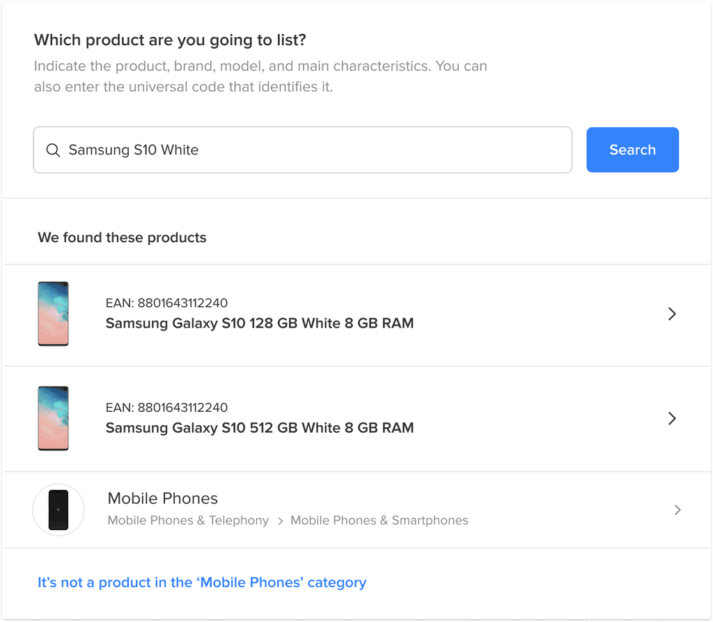
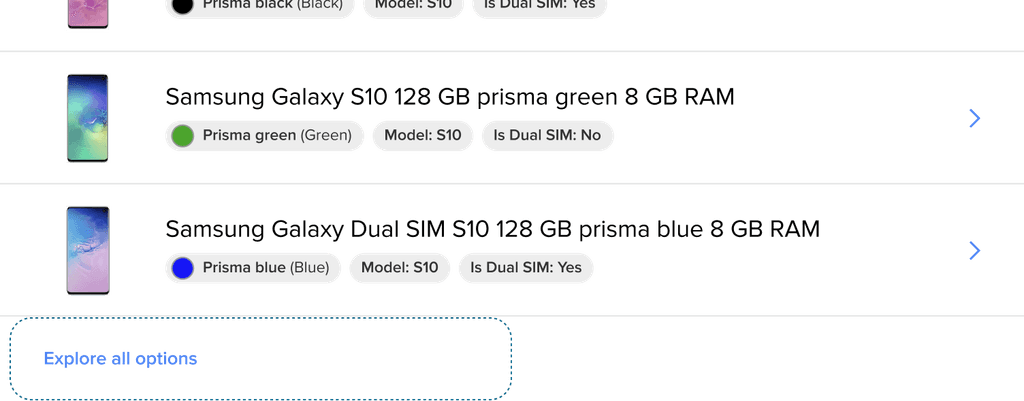
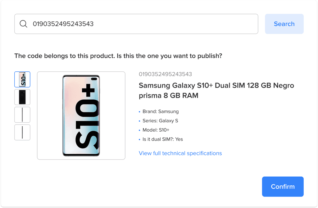
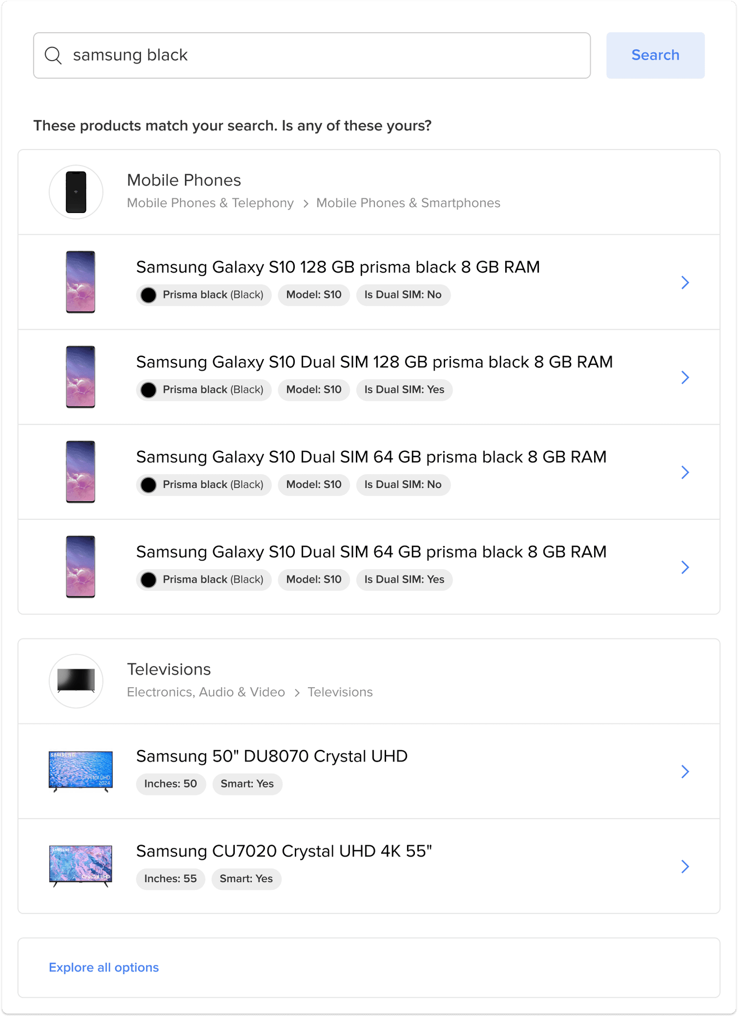
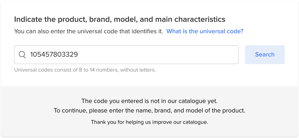
Search product in catalog

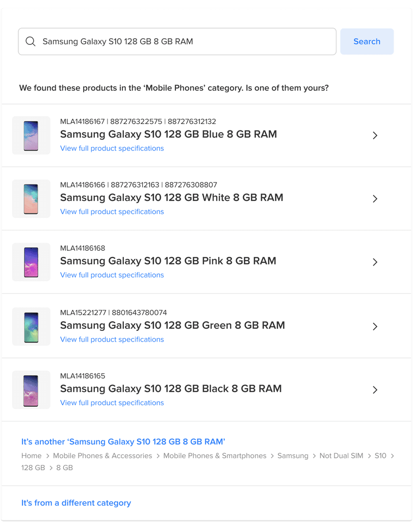
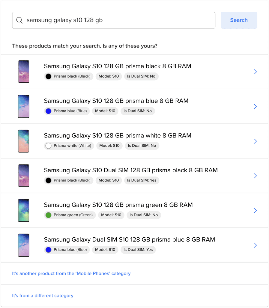
Select matching product from results

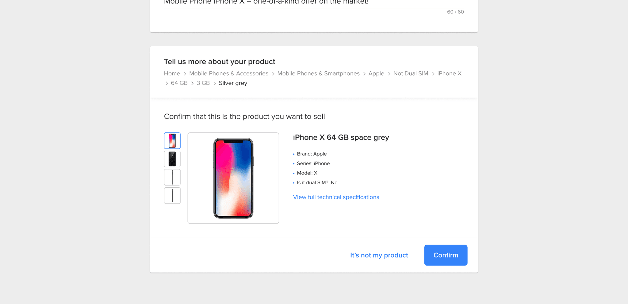
Confirm or edit suggested attributes

Listing created with correct catalog match

Step 2

Step 2

Mapping scenarios

Mapping scenarios

Before designing, I ran sessions with engineers to understand how the search logic would behave. This helped us map out all possible user flows—like exact matches, partial results, or no results—so we could design for every scenario.

There were 7 use cases.

Before designing, I ran sessions with engineers to understand how the search logic would behave. This helped us map out all possible user flows—like exact matches, partial results, or no results—so we could design for every scenario.

There were 7 use cases.

Step 3

Step 3

Develop the visual design

Develop the visual design

Replacing the title field with a search box

Replacing the title field with a search box

The first change in the flow was replacing the listing title input with a search box. This shift was straightforward and aligned with the new logic—helping sellers start by searching for the product instead of writing a free-form title.

The first change in the flow was replacing the listing title input with a search box. This shift was straightforward and aligned with the new logic—helping sellers start by searching for the product instead of writing a free-form title.

Before

Before

After

After

Designing the search results

Designing the search results

The next step was to define how search results would be displayed. I explored different layout and interaction options to ensure sellers could quickly identify the correct product.

The next step was to define how search results would be displayed. I explored different layout and interaction options to ensure sellers could quickly identify the correct product.

List vs. grid

We chose a list view for better readability when many results appear.

!

!

!

!

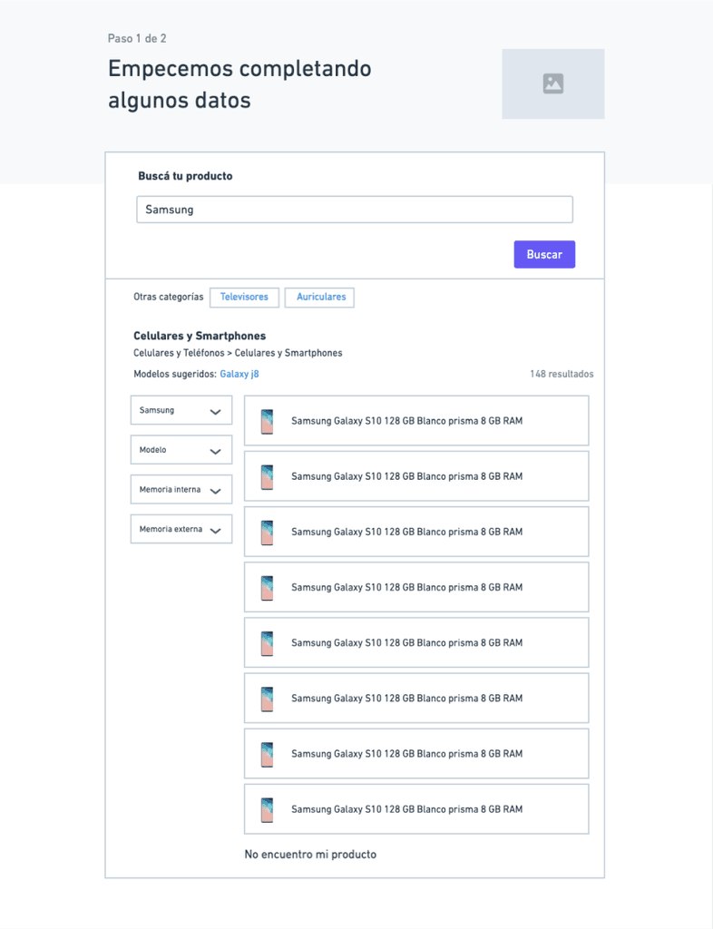
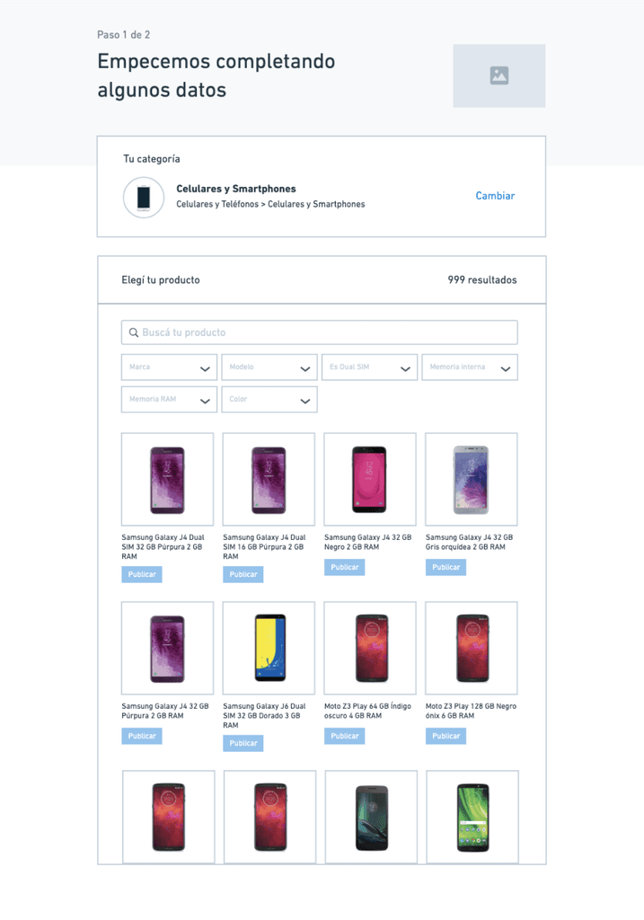
With or without filters?

To keep the flow fast and simple, we removed filters at this stage.

!

!

!

!

Designing it in high fidelity

Designing it in high fidelity

Initial design

Initial design

I used colour as the primary visual cue to differentiate the options.

I used colour as the primary visual cue to differentiate the options.

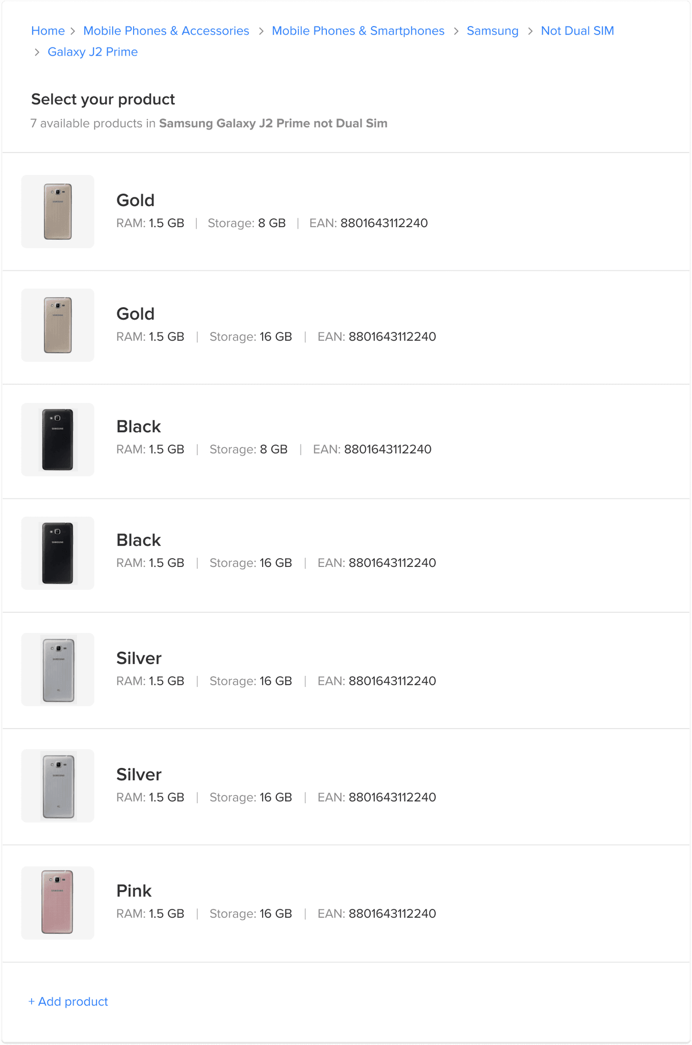
⚠️ Problem: This approach wouldn’t scale, as not all categories use colour as the main identifier.

Iteration 1

Iteration 1

I tried showing the full product title to include all the relevant information. I didn’t separate the attributes visually, since they were already part of the title.

I tried showing the full product title to include all the relevant information. I didn’t separate the attributes visually, since they were already part of the title.

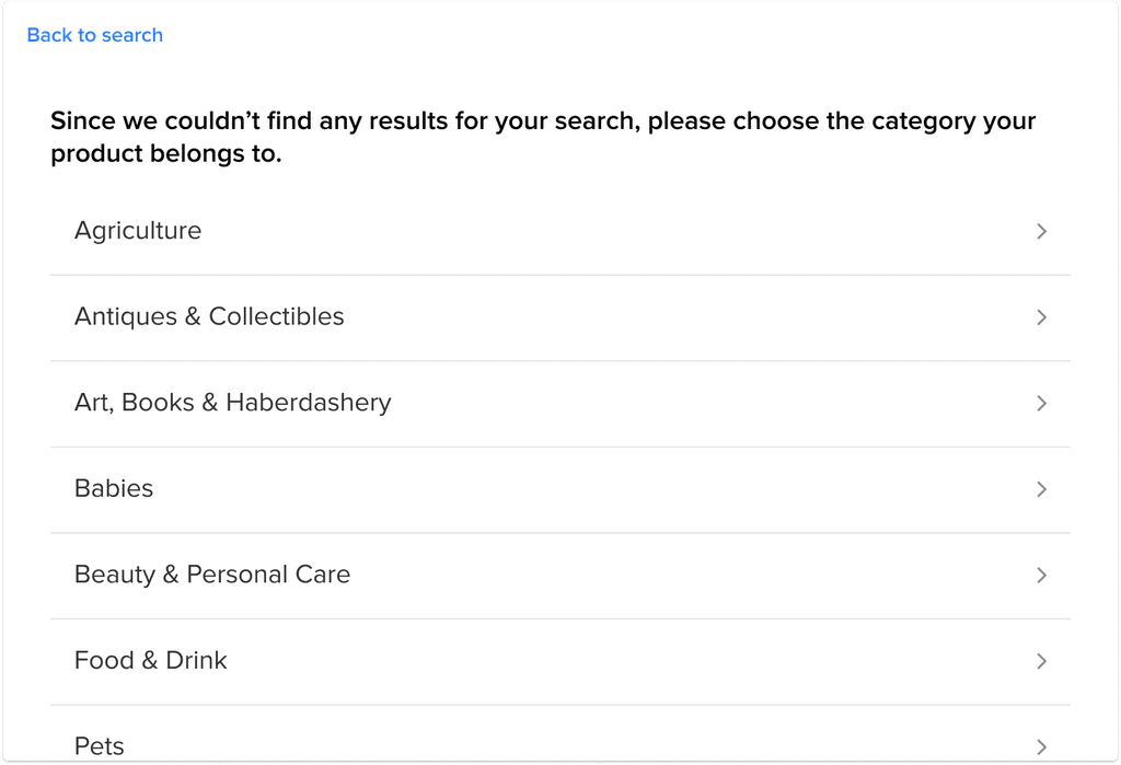
⚠️ Problem: I had hidden the search box to save space, but this wasn’t a good decision, as users might need to refine their search.

Iteration 2

Iteration 2

I added the search box back into the same step.

I also introduced two alternative exit points: selecting a category to find the product manually or choosing a different category altogether.

I added the search box back into the same step.

I also introduced two alternative exit points: selecting a category to find the product manually or choosing a different category altogether.

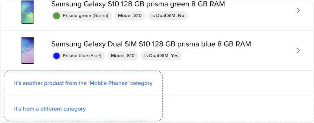
⚠️ Problem: These two actions were visually different, even though they served a similar purpose—opting out of the suggested results.

Iteration 3

Iteration 3

I made the two opt-out actions visually consistent.

To optimise space, I removed the label from the search box—showing it at the beginning, then hiding it once results appeared.

Since I wasn’t sure if the product title alone was enough for sellers to make a decision, I added a link to view more details.

⚠️ Problem: Viewing full details made the task more complex, so I needed a simpler way to provide more information.

Iteration 4

Iteration 4

I added pills to highlight key attributes, making it easier for sellers to compare options at a glance.

I added pills to highlight key attributes, making it easier for sellers to compare options at a glance.

Step 4

Step 4

Validate and iterate

Validate and iterate

We conducted usability testing with six sellers in the cellphone category to validate whether the new flow using the product finder was clear and easy to use.

The goal was to identify any issues with understanding or navigation—especially in cases where only one result appeared, when the desired product wasn’t shown, and when there were no matching products and the user had to select a category manually.

!

!

The main issue I found was that users didn’t understand the difference between the two exit options

The main issue I found was that users didn’t understand the difference between the two exit options

One of the tasks was to have them list an item that wasn’t on the list to see if they figured out how to proceed.

When trying to select an option to see more details, users didn’t know how to continue because they didn’t fully understand the difference between the actions.

One of the tasks was to have them list an item that wasn’t on the list to see if they figured out how to proceed.

When trying to select an option to see more details, users didn’t know how to continue because they didn’t fully understand the difference between the actions.

I ended up merging the two into one simpler action: Explore all options.

I ended up merging the two into one simpler action: Explore all options.

Before

Before

After

After

Designing for all 7 use cases

Designing for all 7 use cases

After completing the search results screen, I moved on to designing the rest of the flow. This ensured we covered all seven identified use cases, providing a smooth and consistent experience. These are the other 6 use cases:

After completing the search results screen, I moved on to designing the rest of the flow. This ensured we covered all seven identified use cases, providing a smooth and consistent experience. These are the other 6 use cases:

One product

One product

One category

One category

Multiple categories

Multiple categories

Multiple products in multiple categories

Multiple products in multiple categories

No results (after searching by query)

No results (after searching by query)

No results (after searching by barcode)

No results (after searching by barcode)

Step 5

Step 5

Implement

Implement

After launching the new flow, the impact was immediate and significant.

The quality of listings improved, sellers had to input less information manually, and the overall process became faster and more accurate — with product match rates increasing from 30% to 90%.

After launching the new flow, the impact was immediate and significant.

The quality of listings improved, sellers had to input less information manually, and the overall process became faster and more accurate — with product match rates increasing from 30% to 90%.

Learnings

Learnings

🤝

Collaborating early with engineers pays off

🤝

Collaborating early with engineers pays off

Working closely with the development team from the start helped us understand technical constraints and adapt the design to how the search logic actually worked. This early collaboration made the implementation smoother and avoided major rework later.

🌈

Flexibility is key for edge cases

🌈

Flexibility is key for edge cases

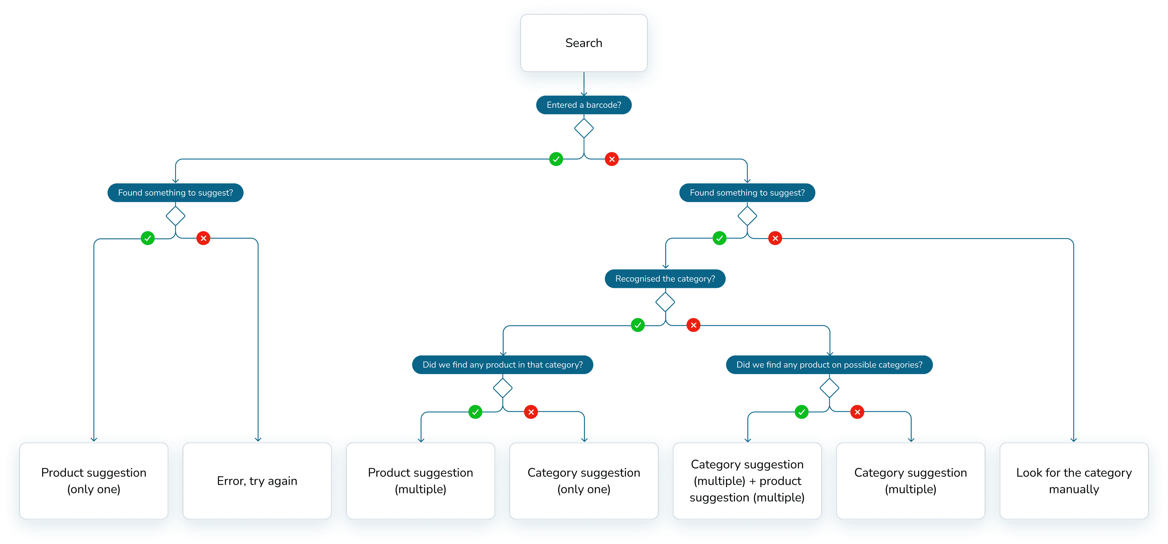
Designing for the ideal flow is easy, but real value came from supporting less straightforward scenarios—like when no product is found or multiple categories are suggested. Making sure the experience stayed clear and useful in all seven use cases was essential for the success of the solution.

❤️

Testing is where good design happens

❤️

Testing is where good design happens

User testing helped uncover key points of confusion, like the unclear exit options when no product matched. Observing how users behaved in the flow allowed us to simplify the experience and make better design decisions.

Back to top