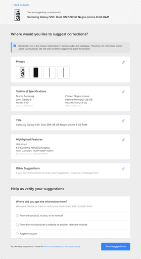
Problem
Problem

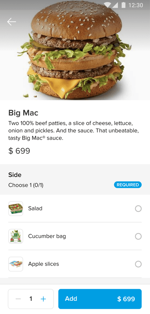
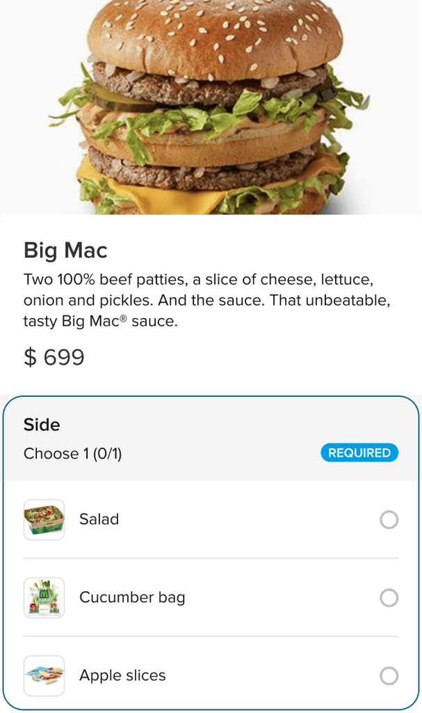
Hello, this is John from McDonald’s menu management team. We need to add fries as a side option for the Big Mac combo on the app.
Could you help with that?
Solution
The process
Hello, this is John from McDonald’s menu management team. We need to add fries as a side option for the Big Mac combo on the app.
Could you help with that?
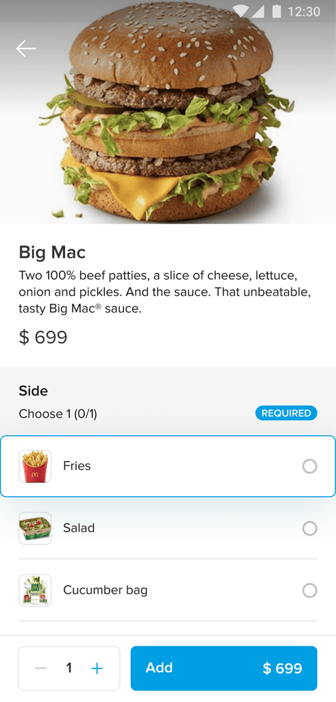
Hi John, no problems at all.
We’ve just added that for you.

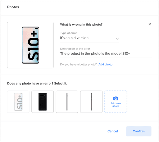
!
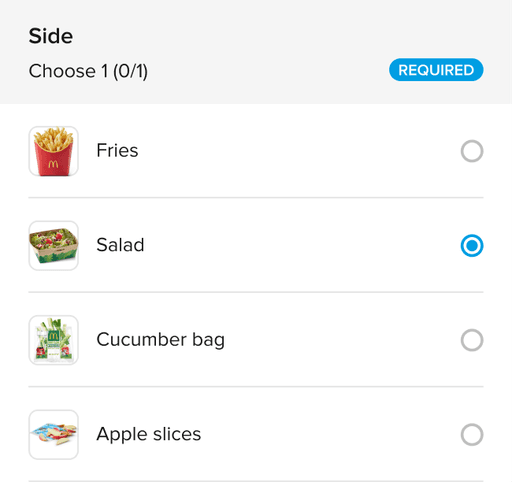
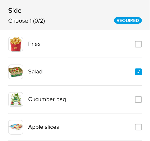
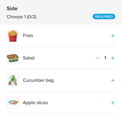
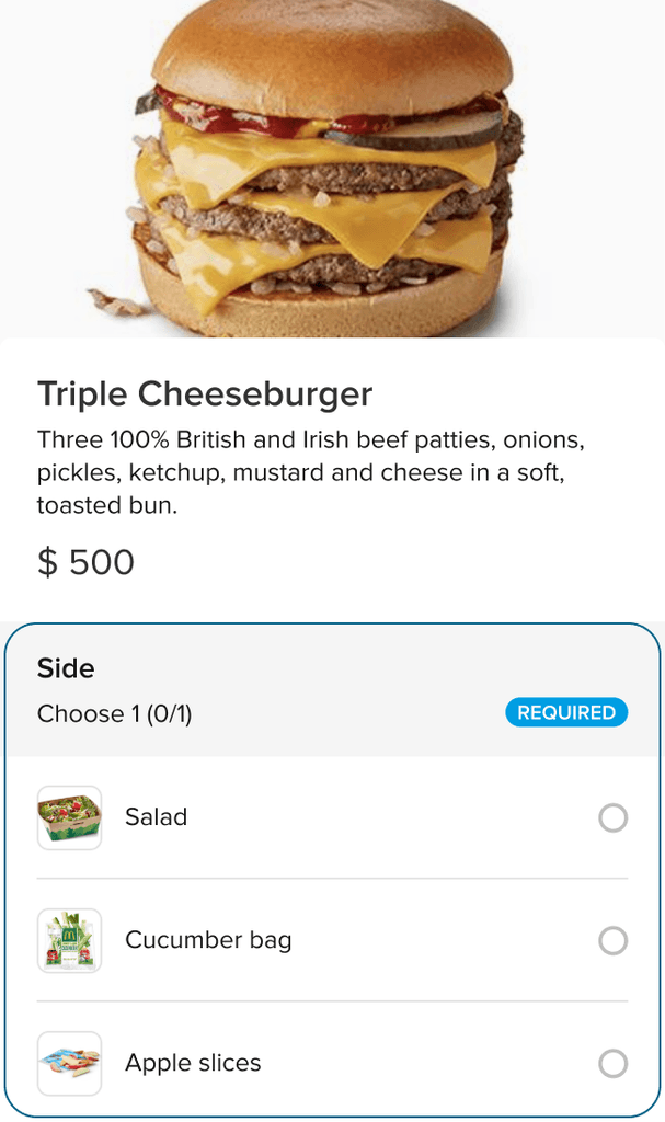
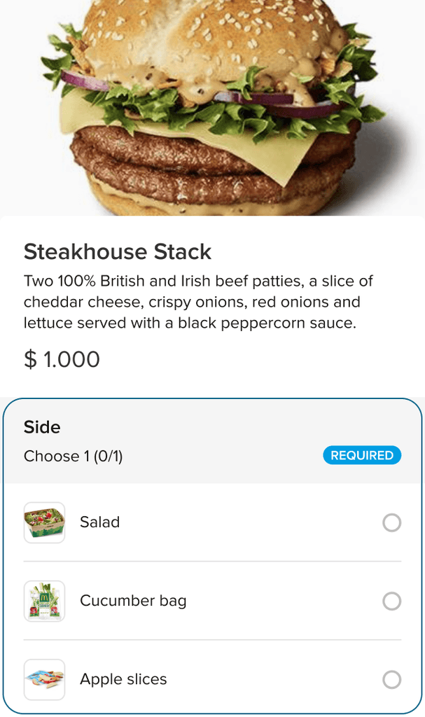
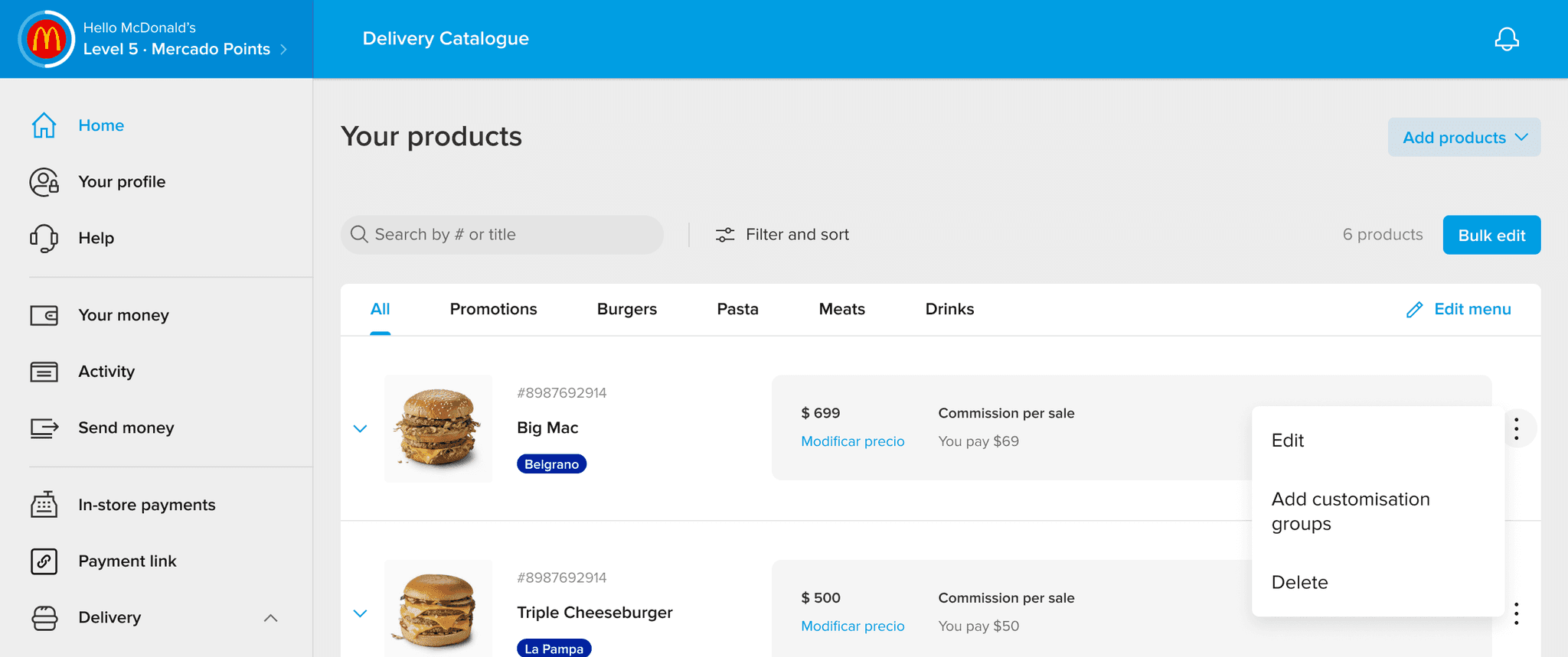
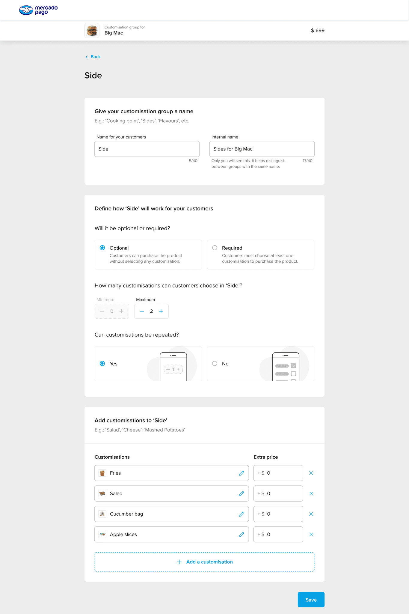
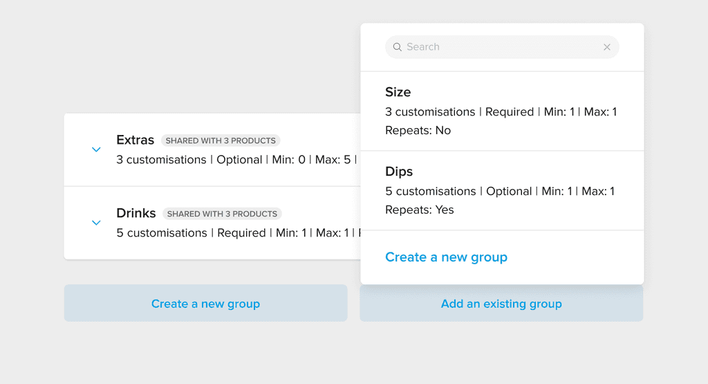
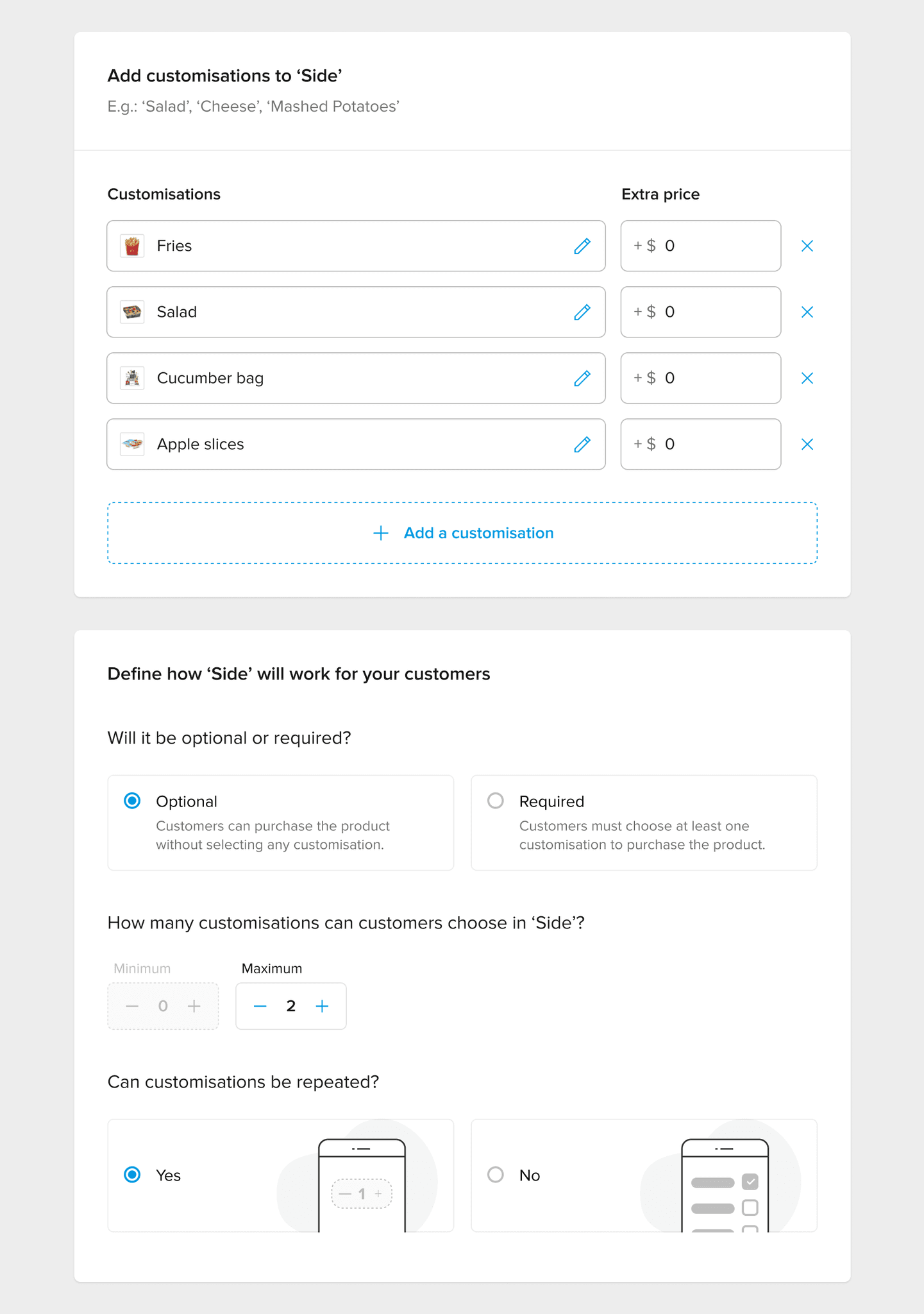
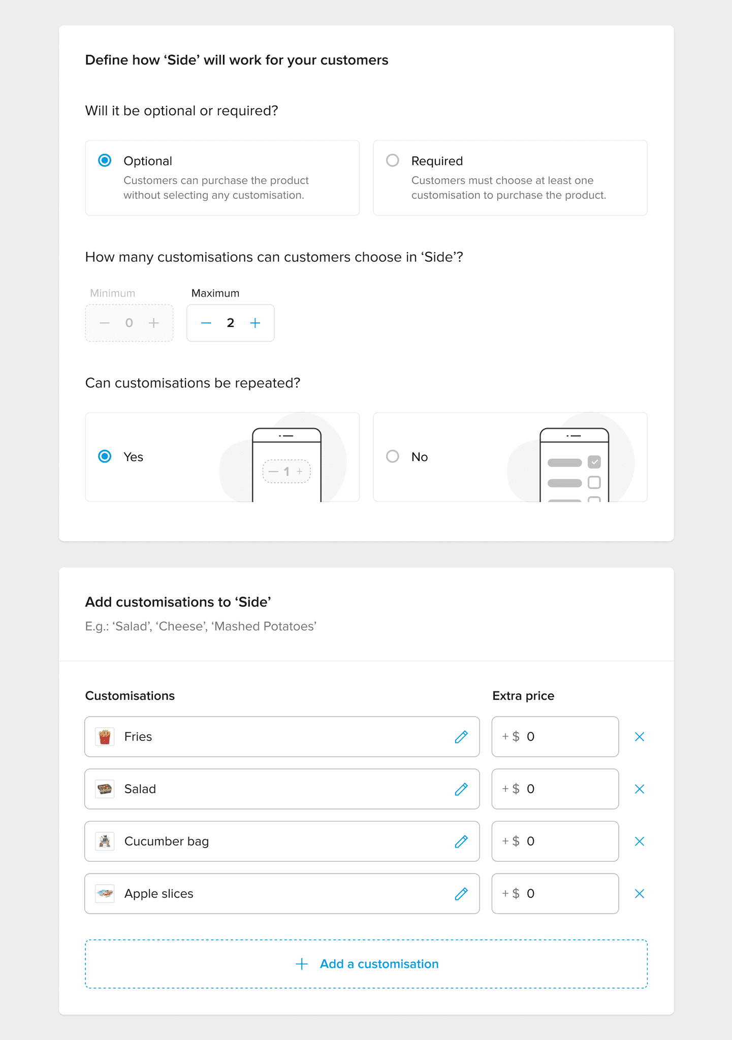
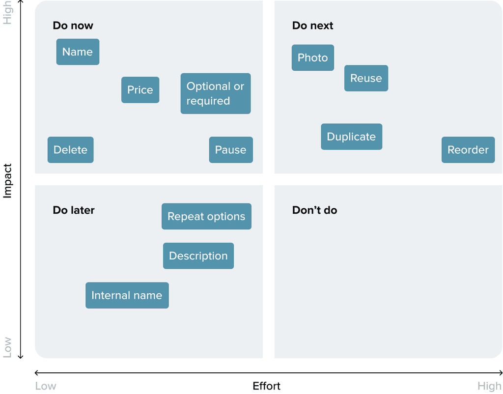
Some customisations were optional, while others were required for the customer to complete their order.
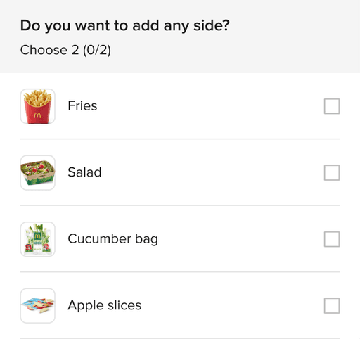
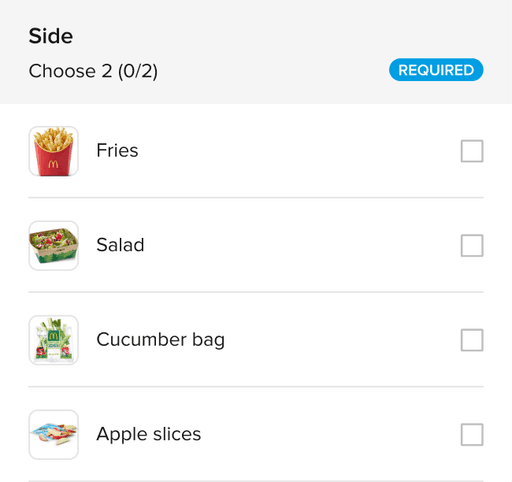
In some cases, users could only select one option.
In others, they could choose multiple.
There were even cases where they could select more than one of the same option.
The allowed number of selections also varied depending on the case.
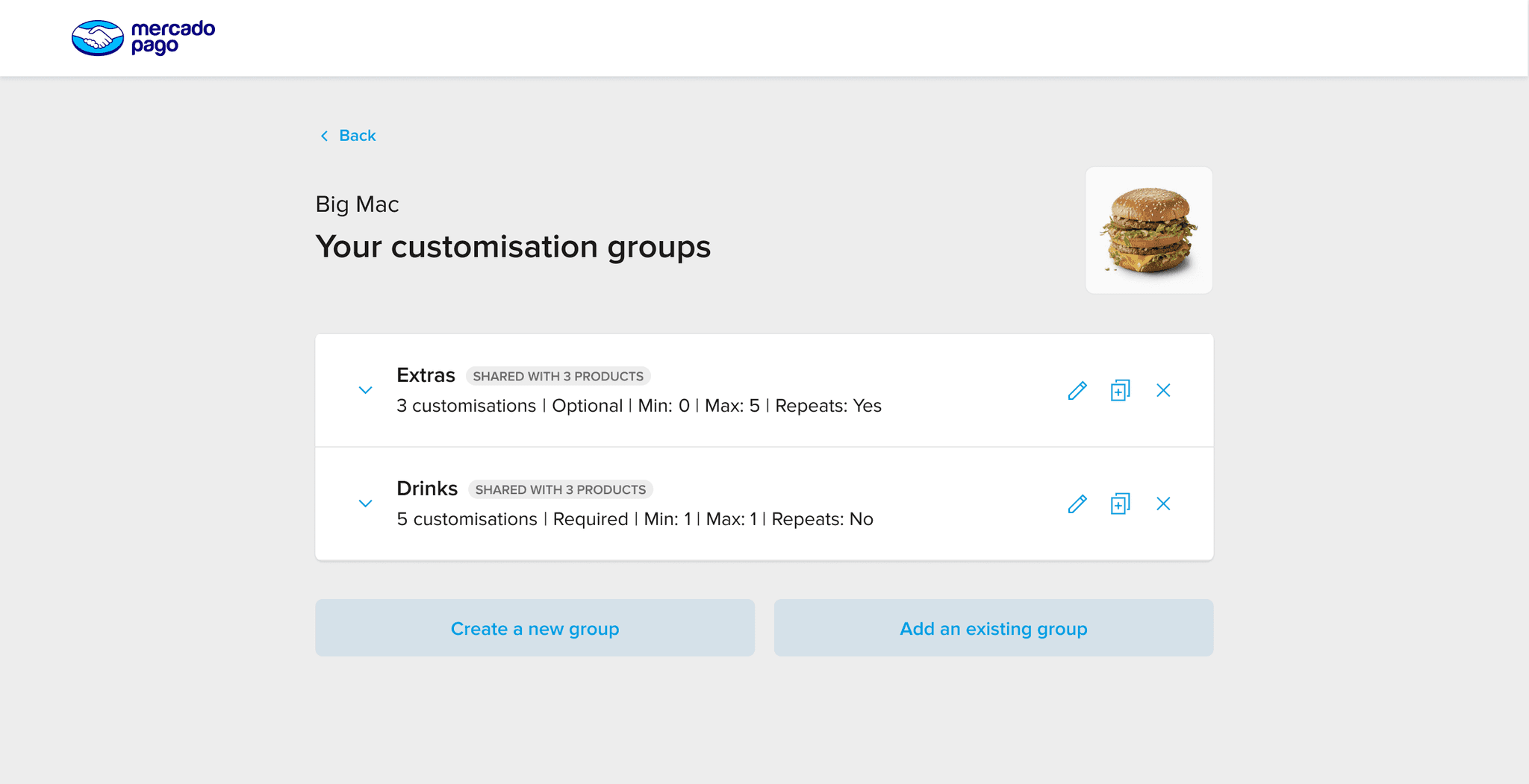
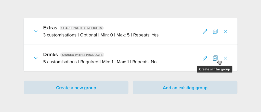
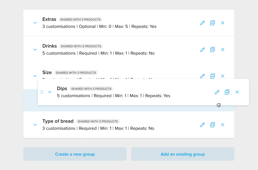
I also discovered that in some cases, different products were using the exact same customisations.
Rappi
Uber eats
iFood
Group name
✅
✅
✅
Required or optional
✅
✅
✅
Minimum quantity
✅
❌
✅
Maximum quantity
✅
✅
✅
Maximum quantity per option
✅
✅
❌
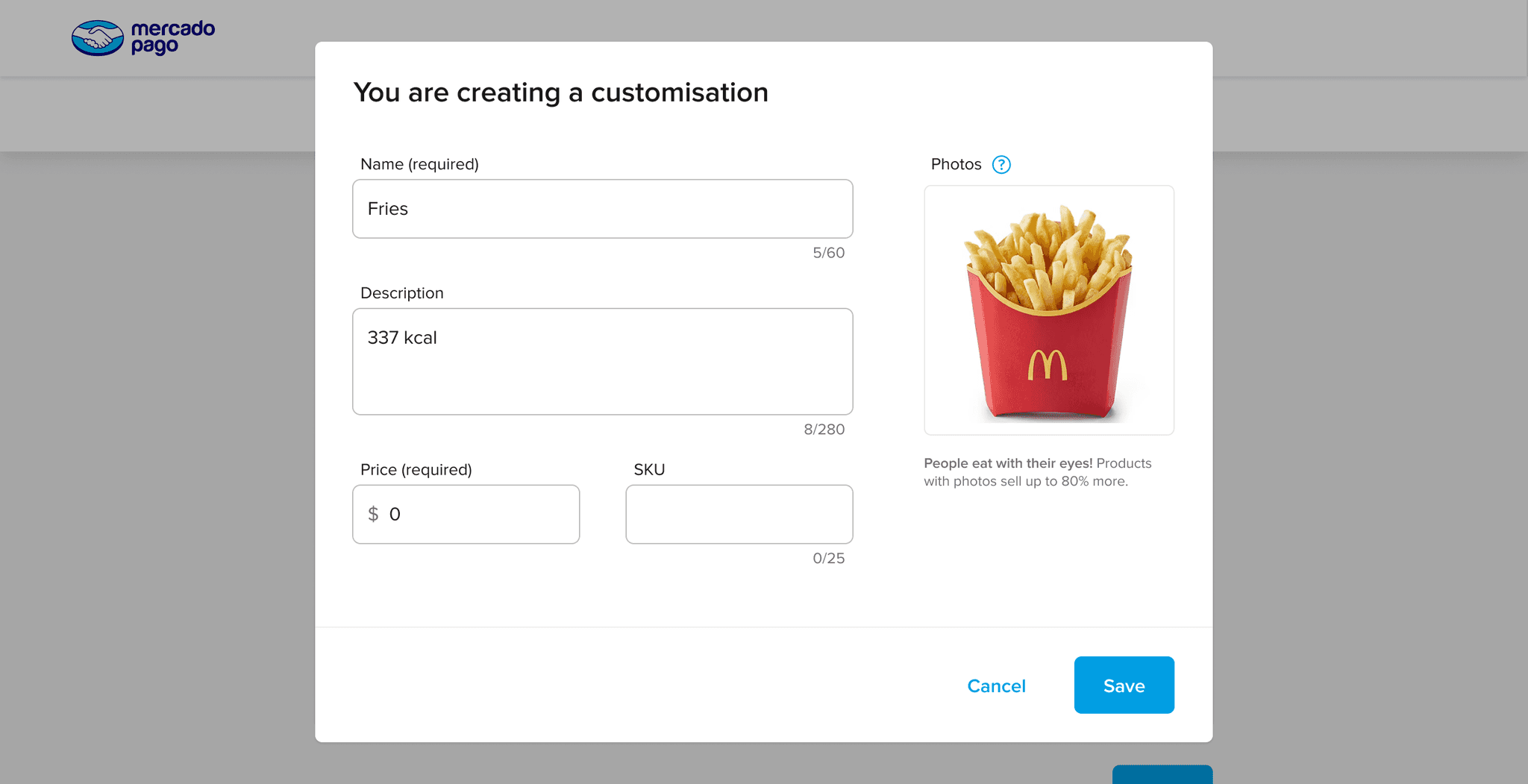
Name
✅
✅
✅
Description
❌
✅
✅
Picture
❌
❌
✅
Price
✅
✅
✅
Category
❌
✅
❌
PDV code
❌
❌
✅
Sell item on its own?
❌
✅
❌
Tax rate
❌
✅
❌
Item out of stock?
❌
✅
❌
Item temperature
❌
✅
❌
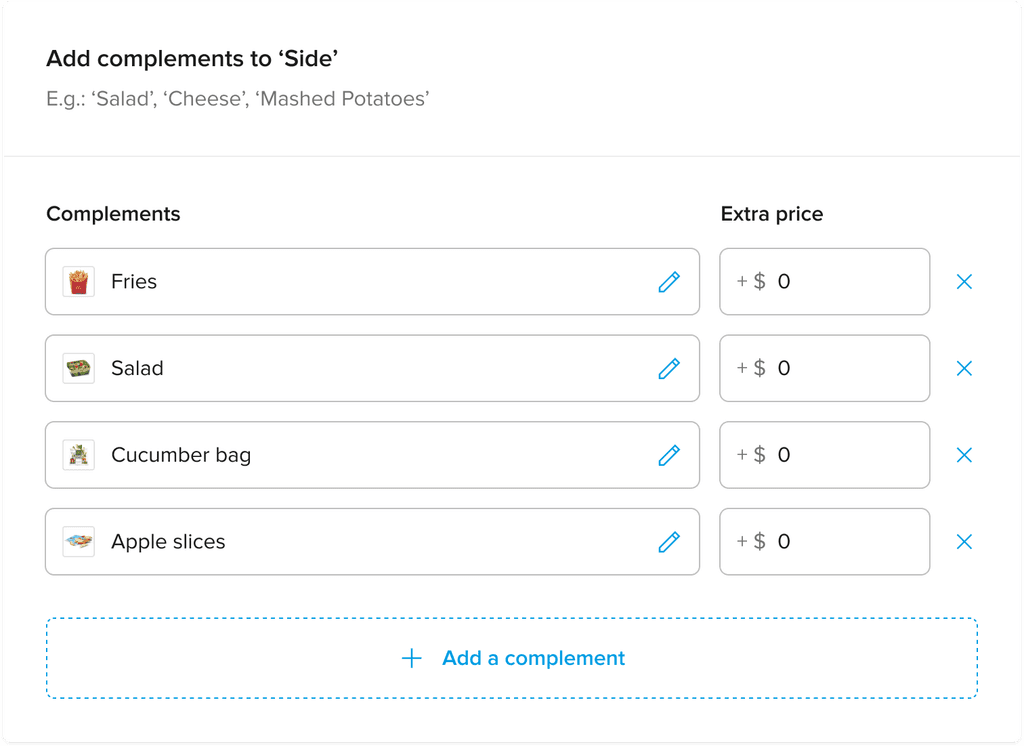
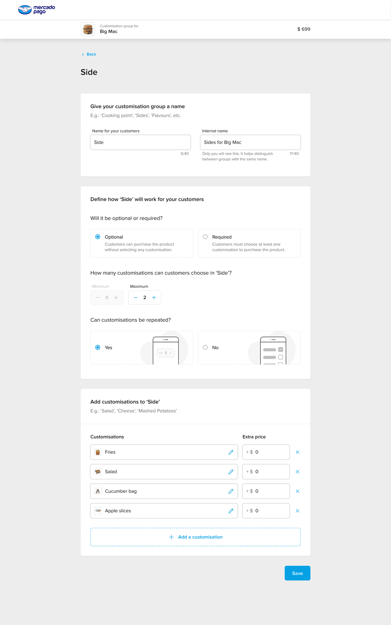
This is the name displayed to buyers.
These rules determine how buyers can select options.
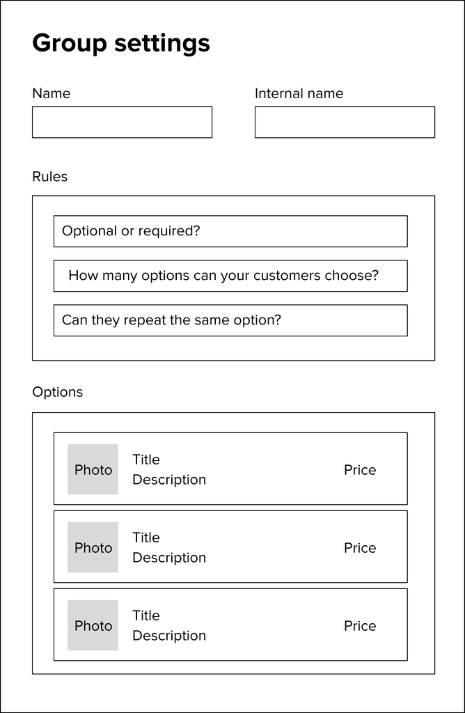
Users might have different versions of the same group (for example, different sides options for different products). This field helps them differentiate between groups that share the same buyer-facing name.
We initially used the term complements, but users found it confusing.
To dig deeper, we ran a separate study where participants were shown examples and asked what they would call those elements. The most common response was customisations, so we adopted that term for better clarity and alignment with user expectations.

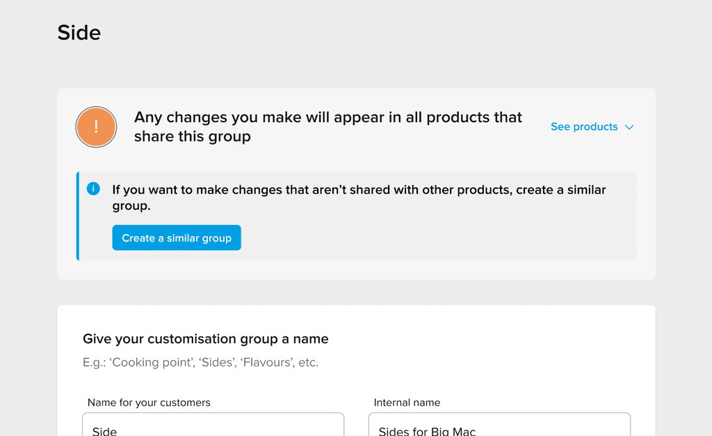
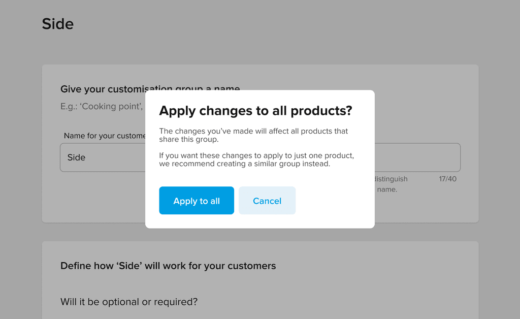
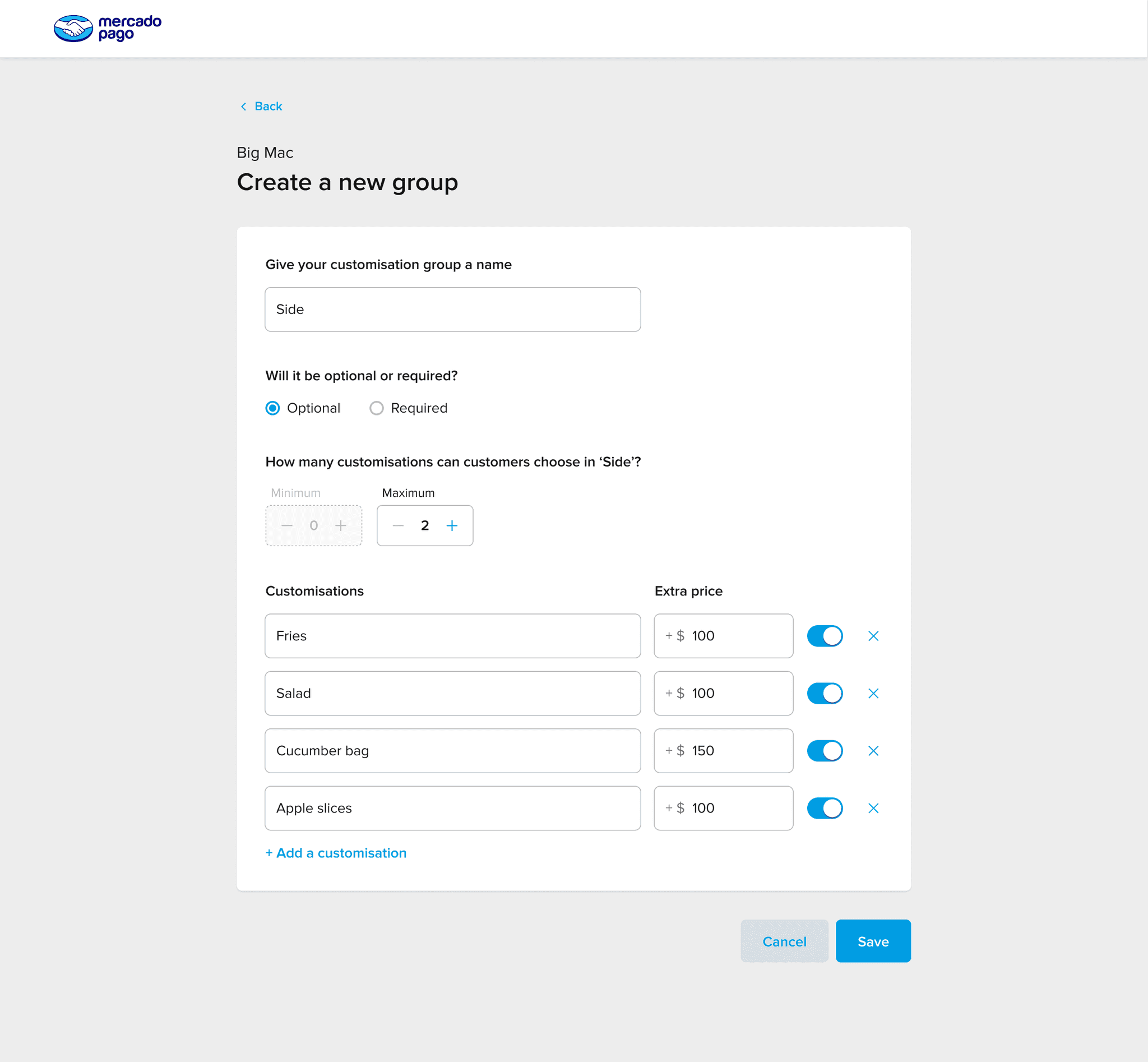
Users didn’t realise that editing a shared customisation would update it across all linked products.
We first tried showing a banner to explain this, but users consistently missed it.
To ensure they understood the impact, we replaced the banner with a confirmation modal that prompts users to confirm before making changes.
To test the ideal order, we showed half of the users the flow starting with the customisation options and the other half starting with the rules.
The version that showed rules first was consistently seen as more intuitive and easier to follow, so we decided to adopt that order in the final design.
Users preferred having the freedom to manage their own customisations rather than relying on internal teams. Giving them the tools to do it themselves not only improved their experience but also reduced dependency and internal operational costs.
Even without all the advanced features we initially envisioned, users were able to complete their tasks effectively. Prioritising core functionality and clear flows proved more valuable than building every “nice-to-have” from the start.
Important information like the shared group warning was initially overlooked when placed in a banner. Replacing it with a confirmation modal made the message unavoidable. Critical content must be embedded into the flow, not just displayed.
Back to top